uwc-radio button components let users select one option from a set.Radio buttons allow the user to select one option from a set of mutually exclusive options. Radio buttons appear in groups with zero or one option selected. For more information about radio groups, see Radio groups.
Radio groups and selects can be used interchangeably in a UI when input is required from the user. For information about when to use these components, see Radio Group and Select.
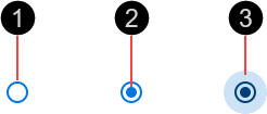
- Outer ring
- Inner disc – When present, indicates the radio button is selected
- Ripple – Visual feedback on user interaction
The outer ring is 20px in diameter.

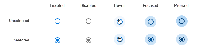
Radio buttons are interactive components that respond visually to user actions and system-initiated events.
Radio buttons provide visual feedback when the pointer hovers over them.

Radio buttons provide visual feedback when pressed, in the form of a radial ripple.

The primary action area of a radio button is the button surface. Press an unselected radio button to select it. If a radio button is in the disabled state, pressing it has no effect.

Our components have been designed to comply with the WCAG 2.2 AA accessibility guidelines. For more information about how our design system complies with color-related accessibility guidelines, see Foundations > Colors > Accessibility.
For more information about radio buttons, see:
- Material Design – Components > Selection controls > Radio buttons
- Material UI – Components > Inputs > Radio
Related components: