uwc-button components allow users to take actions, and make choices, with a single click or tap.Buttons communicate actions that users can take. Our design system distinguishes four button styles for specific needs.
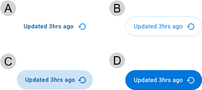
- Standard
- Outlined
- Contained
- CTA (Call To Action)
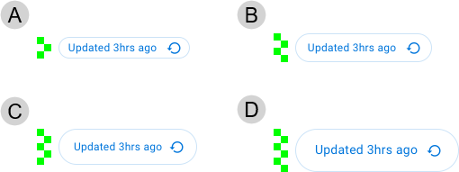
Buttons can include a leading or trailing icon. Buttons are available in four sizes: small, medium, large and extra-large.
In general, use buttons for all interface actions on the current screen that are not links to other views in the application. Use large buttons except where design requirements mandate using a different button size; for example, if your UI has limited space, or to satisfy size-related accessibility requirements.
To prevent a button label wrapping (for example, if the label is very long), the labelOverflow property can be set to "ellipsis". See live demo below (select "Contained Button - with ellipsis" in dropdown)

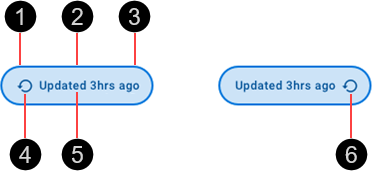
- Container
- Border
- Fill
- Leading icon (optional)
- Text label
- Trailing icon (optional)
The button with leading icon variations extend a standard button component, inserting an icon before the text label. Similarly, the button with trailing icon variation adds an icon after the text label. These variations provide a compact alternative to using separate button and icon components.
Use a leading or trailing icon to signify the action performed when the button is selected.
Leading icons change their position based on LTR or RTL contexts.

- Standard – Standard buttons are the default type of button to use in your UI. Use a standard button when none of the other button types are applicable. Standard buttons are typically used for less-pronounced actions, including those located in dialogs and cards. In cards, standard buttons help maintain an emphasis on card content.
- Outlined – Outlined buttons are low-emphasis buttons that always have the visual appearance of a button (unlike standard buttons which appear as text in the enabled state). Use outlined buttons for optional actions in your UI. Outlined buttons can be used interchangeably with standard buttons.
- Contained – Contained buttons are medium emphasis buttons, offering a lower emphasis alternative to CTA buttons or a higher emphasis alternative to outlined buttons. Use emphasis buttons for actions that are important but aren't the primary action.
- CTA – CTA (Call To Action) buttons are prominent, high-emphasis buttons that represent primary actions. Use a CTA button on each screen/page in your UI to communicate to the user which action they are expected to take.
Note: The button type properties should be used singly rather than in combination.
Button size is based on an integral number of nudges, where 1 nudge is 8px ().

- Small – Based on a height of 3 nudges (24 px)
- Medium – Based on a height of 4 nudges (32 px)
- Large – Based on a height of 5 nudges (40 px), using 18px icons
- X-Large – Based on a height of 6 nudges (48 px)
Buttons are interactive components that respond visually to user actions and system-initiated events.
Buttons are interactive components that provide visual feedback when the pointer hovers over them.

Buttons provide visual feedback when pressed, in the form of a ripple fill.

The primary action area of a button is the button surface. Click or tap a button to initiate the action linked to it. If a button is in the disabled state, no action will take place.
A button may perform a supplemental action when you click or point the cursor at it. For example, it may display a menu.
- Use buttons to perform an action.
- Use CTA property for the primary, most important or most common action on a screen.
- Use contained property for medium-emphasis actions that dont destract from other on-screen elements.
- For low-emphasis actions, no additional property setting is required. An alternative is to use a uwc-icon-button.
- When multiple actions are available, place buttons next to each other with the CTA at the end.
- Avoid placing a button below another button if there is space to place them side-by-side.
- Keep labels concise and sentence-case, e.g. "Submit form".
- Buttons should widen dynamically to contain the label text. Don't wrap text.
- Icons are optional, using the icon property.
Our components have been designed to comply with the WCAG 2.2 AA accessibility guidelines.
- Tab key lands focus on (non-disabled) button.
- Space / Enter activates the (non-disabled) button.
The <uwc-button> component inherits from mwc-button (Material Web Components), which itself extends the native HTML <button> element.
For more information about buttons, see:
- Material Design – Components > Buttons
- Material UI – Components > Input > Button
Related components: