uwc-radio-group components let users select one option from a set.Radio groups are input components that allow the user to select one from a set of items. As the name suggests, the items in a radio group are radio buttons that represent a set of mutually exclusive items from which the user can select one.
Radio groups and selects are input components that can be used interchangeably in a UI when input is required from the user. However, in some scenarios radio groups are a better design choice and will make your UI easier to use.
- When you need the user to see all options; for example, there is no clear default or recommended option, or options may be unfamiliar to the user.
- When there are a small number of options (less than five). The user can quickly scan the options in a radio group and select one with a single click while a select requires two clicks: one to open the menu and a second to select an item.
- When the options include comparative data; for example, a set of pricing options from which the user must select one.
- Generally, when visibility and a quick response is a priority.
If you're not sure if a radio group is the right component to use, see Select to find out if you should use a select instead.
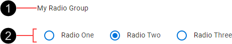
- Text label
- Radio buttons
By default, a radio group's items are arranged horizontally. This arrangement of radio buttons presents a compact component, but may also cause some confusion about which label corresponds to which radio button. Reduce the chance of any confusion by ensuring a minimum spacing of 7 nudges (56px) between each radio button and the label for the preceding radio button.

Radio groups support normal and dense formats. Dense radio groups use a smaller font.

By default, a radio group's items are arranged horizontally. While this arrangement of radio buttons may present a compact component, it may also cause some confusion about which label corresponds to which radio button.
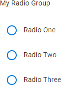
An alternative layout is the stacked layout in which radio buttons are arranged vertically. This layout has the advantage of unambiguously associating a radio button with its corresponding label. Further, the stacked layout provides more space for radio buttons with lengthy labels. Prefer the stacked layout unless your UI demands to be more compact.
Radio groups are interactive components that respond visually to user actions and system-initiated events.
Radio groups exhibit the hover and ripple behaviors of radio buttons. For details, see Radio > Behavior.
A radio group can have only one selected item. When a radio button is selected, all other radio buttons in the group become unselected.
In the following example, the first radio button in the radio group is selected (A), and the user selects the second radio button (B).
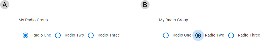
After selecting the second radio button, it is displayed in the selected (focused) state and the first radio button, which was previously selected, is now displayed in the unselected state.
The primary action of a radio group is selecting an item. Press a radio button to select it and unselect any previously selected radio button. For more information about this behavior, see Mutual exclusion.
If a radio group is in the disabled state, pressing its radio buttons has no effect.
Our components have been designed to comply with the WCAG 2.2 AA accessibility guidelines. For more information about how our design system complies with color-related accessibility guidelines, see Foundations > Colors > Accessibility.
For more information about radio groups, see:
- Material Design – Components > Selection controls > Radio buttons
- Material UI – Components > Inputs > Radio > RadioGroup
Related components: