uwc-date-relative-picker component is an inline picker that lets users select a fixed or relative date.The date relative picker is an input component that provides access to a dialog where the user can select either a fixed date or a relative date based on a reference date and an offset period. The resulting value is Temenos-specific.
Date relative pickers use a compact design to improve usability on various devices. The picker's dialog has two UI variations, each of which corresponds to one of the following supported date types:
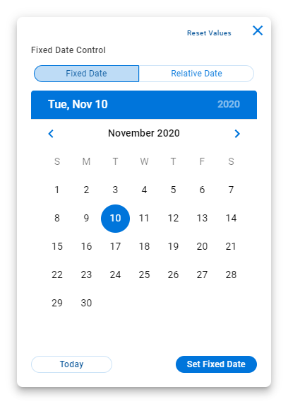
- Fixed
- Relative
Our date relative picker is based on our text field component. Both date types share a similar anatomy, which is illustrated here using the Relative date type.
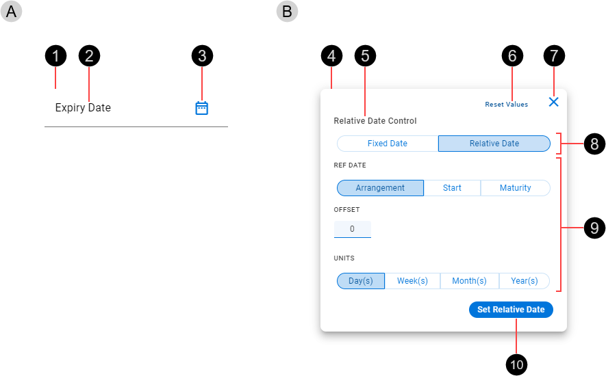
- Date relative picker input component (Text Field)
- Container
- Text label / Dynamic data
- Trailing icon – Click to display dialog
- Date relative picker dialog
- Card / Container
- Dialog label
- Reset button
- Close button
- Date type
- Date selector
- Set date CTA button
Fixed – Select a fixed date from a calendar. Press Today to select the current date.
Relative – Select a reference date and an offset period consisting of an integral number of periodic units.

Date relative pickers are available in normal (medium) and dense (small) sizes. Date relative picker size is based on an integral number of nudges, where 1 nudge is 8px ( ).
).

- Small – Based on a height of 5 nudges (40 px)
- Medium – Based on a height of 7 nudges (56 px)
Date relative pickers are interactive components that respond visually to user actions and system-initiated events.
The layout of the date relative picker dialog changes as different date types are selected. See Content > Date types for details.
Our components have been designed to comply with the WCAG 2.2 AA accessibility guidelines. For more information about how our design system complies with color-related accessibility guidelines, see Foundations > Colors > Accessibility.
Related components: