Use Expandable Card
Expansion panels, also known as accordions, expand and collapse to show and hide the content within. An expansion panel is a collapsible contained unit, usually used in multiples to keep pages shorter when the contained content does not need to be viewed always. Like cards, expansion panels and their content should be easy to scan for relevant and actionable information. Place components, like text and images, in expansion panels in a way that clearly indicates hierarchy.
Use expansion panels as an alternative to tables when you need to repeat information or input for multiple instances of an entity type, but the columnar format of a table is not appropriate.
Expansion panel layouts can vary to support the different types of content they contain.
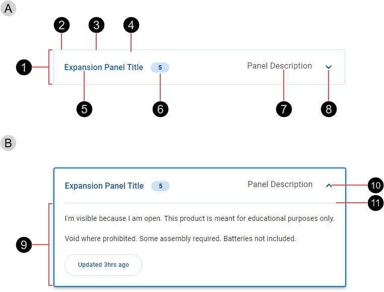
- Collapsed expansion panel
- Header
- Container
- Border
- Fill
- Title (recommended)
- Badge (optional)
- Description (optional)
- Expand icon
- Expanded expansion panel
- Panel content
- Collapse icon
- Divider
The position of elements is described for the RTL context.
The expansion panel header includes one mandatory element, an expand/collapse icon, displayed as the rightmost element of the expansion panel. It is recommended to include a title that identifies the specific entity instance.

A description is optional, displayed on the right just before the expand/collapse icon.

An optional heading badge can be included. The badge type and color are configurable.

The panel content appears within the expansion panel when it is expanded, beneath the divider that separates the header from the content.
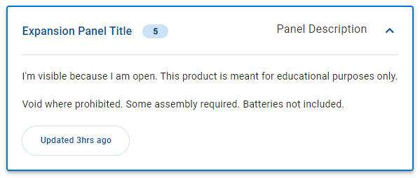
Panel content can include both display and input fields. Don't include other containers such as cards, or page-level components such as navigation rails.
Expansion panels are typically used in a vertical stack representing distinct instances of the same entity type.
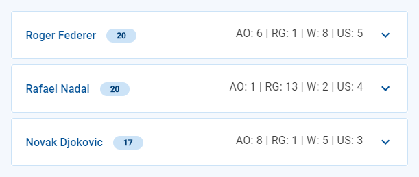
By default, panels appear in the collapsed state showing just the header and displaying useful information that reduces the user's need to expand the panel.
- The panel's title displays the entity's primary identifier, allowing the user to easily distinguish items and locate items of interest.
- The optional panel description contains significant or useful information that saves the user from needing to expand the panel, or that helps the user to distinguish between two panels with identical or similar titles.
- An optional badge displays brief information such as a summary or aggregate of hidden fields, or an indicator suggesting to the user that they need to expand the panel and view further details.
By default, badges use background color Temenos-Light. In specific scenarios, you can use a different badge color; for example, to indicate to the user that they may want to expand a collapsed panel to view new information or to address errors.
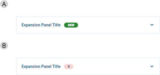
- Badge color: Status-Success Primary
- Badge color: Status Error Light
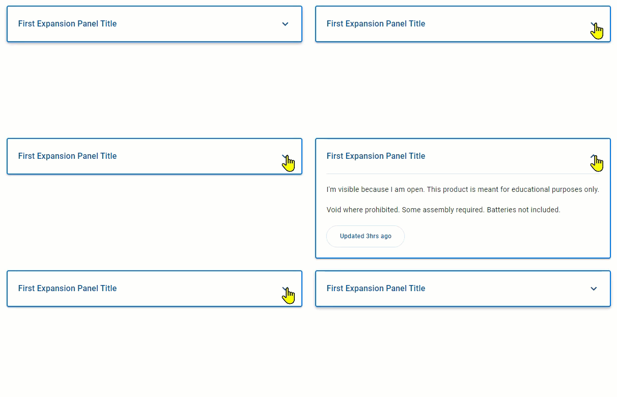
Expansion panels are Interactive components that provide visual feedback when the pointer hovers over them.

By default, expansion panels are displayed in the collapsed state. Click the expand icon () to expand the panel, revealing the panel content. Click the collapse icon (
) to collapse the panel, hiding the panel content.
Our components have been designed to comply with the WCAG 2.2 AA accessibility guidelines. For more information about how this design system complies with color-related accessibility guidelines, see Foundations > Colors > Accessibility.
Related components:
References:
- Material UI – Material UI > Components > Surfaces > Accordion
- Carbon Design System – Components > Accordion > Usage
- Hoa Loranger, Accordions Are Not Always the Answer for Complex Content on Desktops (Nielsen Norman Group, 2014)