uwc-navigation-rail components provide a sticky left-hand navigation menu with logo and buttons. Define onClick events inside each menu item to bring it to life. If you are using sub-menus, action events are required in order to support multiple clicks.The navigation rail is a navigation component that provides a compact arrangement of high-priority destinations or actions within user reach, especially on larger and complex screens. It contributes to UI consistency and complements adaptive and responsive navigation patterns.
Navigation rails have a compact design with reduced spacing (padding) around and between the elements.
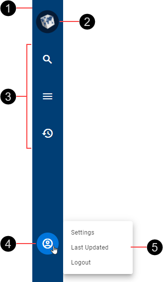
- Container
- Logo
- Destination icon buttons, showing various states
- Bottom menu icon button (optional)
- Bottom menu (optional)
- Active
- Hover
- Focused
Navigation rails use 24px icons.

Navigation rails are interactive components that provide visual feedback when the pointer hovers over them.
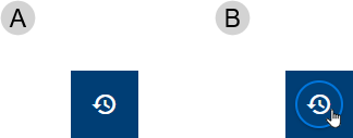
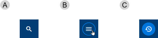
Active (A) and hover (B) states for destination icon buttons. The key visual difference is a colored ring in the hover state.
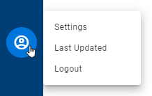
The optional bottom menu button provides access to a menu that you can use for user and application actions.
- User-focused actions such as profile settings and logout from application
- Application-focused actions such as refreshing application data and showing when this last happened.
Our components have been designed to comply with the WCAG 2.2 AA accessibility guidelines.
- Set labelDisplayType to text on navigation rail items so that their labels are always visible.
For more information about navigation rails, see:
- Material Design – Components > Navigation rail.
Related components: