uwc-combobox components let the user choose one or more items from a list.The combobox is an input component, composed of a text field and a list, that displays one or more selected items as chips in the text field. Comboboxes let you restrict input to a pre-defined set of items, with modes for multiple or single selection.
Click or tap a combobox to display its dropdown list which shows all the available items. Type in the text field to filter the items shown in the dropdown list. When the dropdown list is displayed, click or tap an item to select it.
Use a combobox for an input field that allows one or more items to be selected from a list. If you need to restrict input to a single item, use the combobox in 'single' mode; This gives a behaviour equivalent to a Radio Group or Select instead.
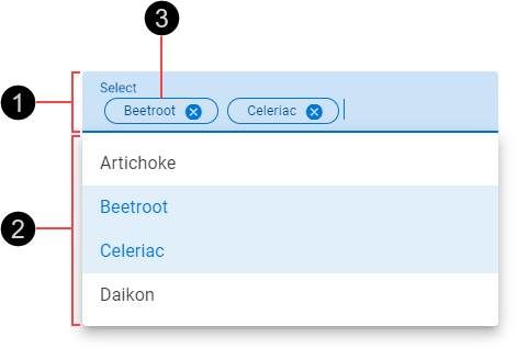
- Text field
- Dropdown list
- Input chip
A chip is displayed in the combobox's text field for each selected item in the dropdown list. Each chip's text label matches the text label of the corresponding list item. Chips appear in the order they are selected.
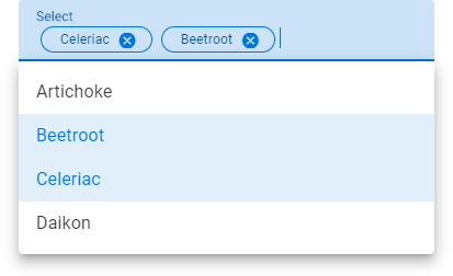
Comboboxes have a fixed height but their width changes as items are selected and removed.
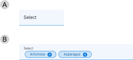
- Empty combobox – Default width
- Filled combobox – Width resizes to accommodate input chips while maintaining space on the right to type in
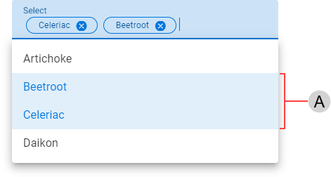
Selected list items (A) are shown in a contrasting style.
Real time validation helps to streamline the data entry process and keep data clean. While comboboxes don't permit invalid input to be entered, they can be configured as mandatory fields.
For more information about how comboxes deal with validation errors, see:
- Material Design – Required text indicator in Components >Text fields > Anatomy
A combobox's text field element uses colors from the Status Negative color palette to indicate an invalid condition is detected.
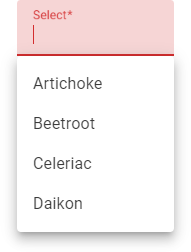
The combobox's list supports selection of multiple items. See List for details.
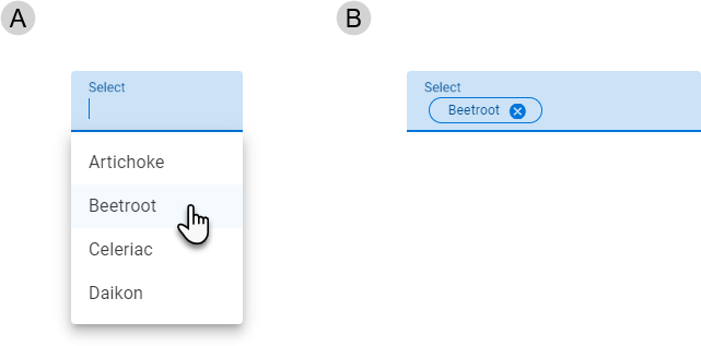
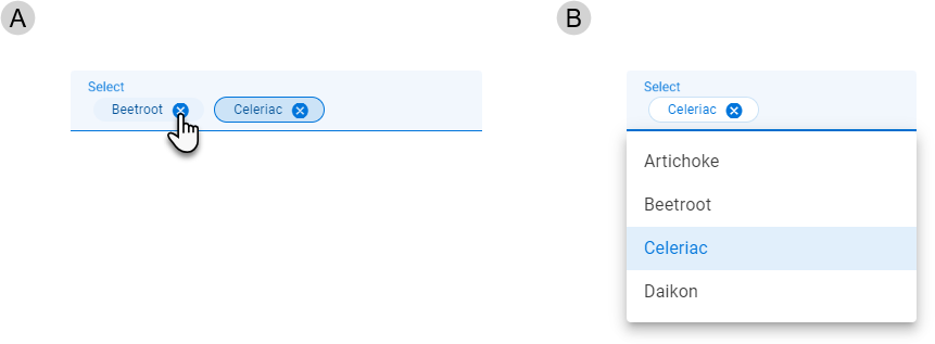
Selecting an unselected item from the dropdown list (A) adds a corresponding chip to the text field element (B).
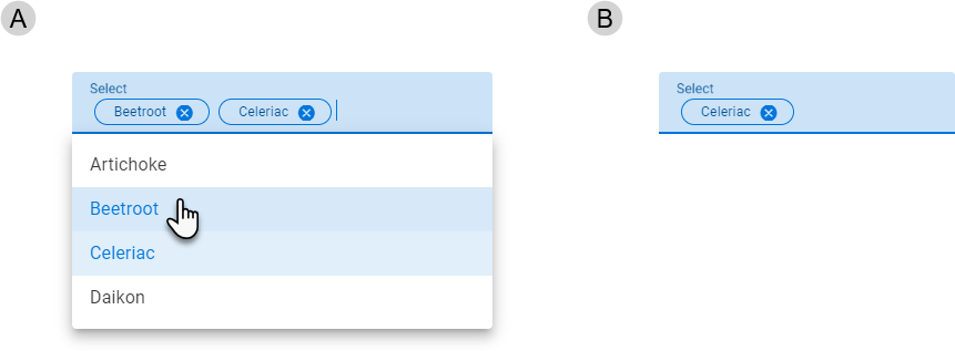
Selecting a selected item from the dropdown list (A) hides the corresponding chip in the text field element (B).
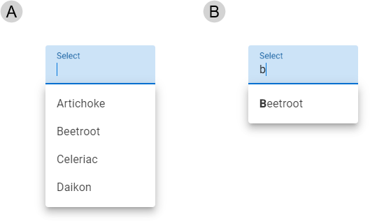
Type in the combobox's text field to filter the items displayed in the dropdown list. The dropdown list opens when you start typing (A) if it is not already open. As you type, the list is filtered, showing only items that start with the entered text. Matching items show the typed text in bold font (B).
Click or tap a chip's trailing icon () to remove the chip and unselect the item.
Our components have been designed to comply with the WCAG 2.2 AA accessibility guidelines. For more information about how our design system complies with color-related accessibility guidelines, see Foundations > Colors > Accessibility.
Related components: