Color is a powerful tool for conveying meaning and emphasizing elements and actions to users. Color plays an essential role in our design system, helping to maintain consistent and engaging digital experiences right across Temenos from applications to experiences.
Colors help to indicate each element's state; for example, grey text and background make a button look disabled. For more information, see the States section for each component in this documentation.
Colors and color contrast in our design system have been validated to meet the WCAG 2.2 AA accessibility guidelines. For more information, see Web Content Accessibility Guidelines (WCAG) 2.2.
To create contrast between elements, such as a top app bar from a system bar, you can use light or dark variants of the primary colors. You can also use these to distinguish elements within a component.
We have developed the color system so you can select your color combinations to meet the following AA contrast requirements:
- 4.5:1 – Standard type: all text and non-text elements.
- 3:1 – Large, heavier type: text 18px and above, 14px bold and above, as well as non-text elements requiring contrast.
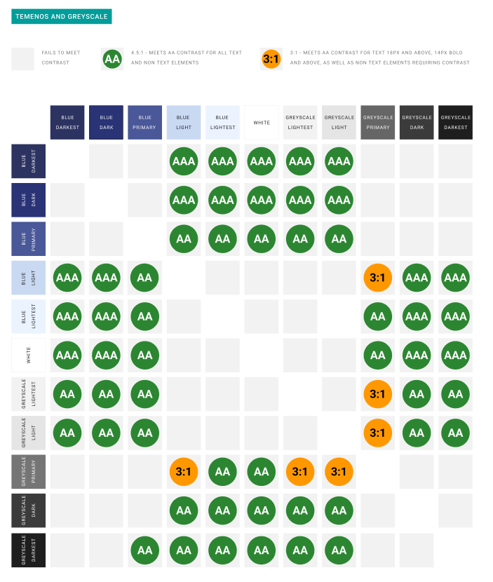
The WCAG 2 compliant color combinations in our color system are shown above. For more information about WCAG 2 color contrast guidelines, see WCAG 2.2, 1.4.3 Contrast (Minimum)§.
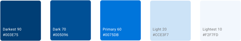
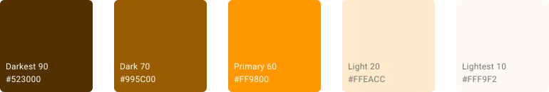
Each of the colors defined in our color system is represented by a design token. For example, here are the design tokens for the colors in the Temenos palette.
- Temenos Darkest 90 – --uwc-color-brand-darkest
- Temenos Dark 70 – --uwc-color-brand-dark
- Temenos Primary 60 – --uwc-color-brand-primary
- Temenos Light 20 – --uwc-color-brand-light
- Temenos Lightest 10 – --uwc-color-brand-lightest
For a full list of color-related design tokens, see Tokens.
We have developed a simple but effective color system that combines a set of complementary color palettes which can be applied in a consistent way. This approach follows our principles Simple and progressive and Aesthetics with a purpose, avoids too many color combinations which would add visual noise to the UIs, and aids in keeping our UIs elegant and refined.
Blue is at the heart of Temenos. Our color system is based on a blue palette inspired by the Temenos primary brand color. To this we add a palette of neutral grays, and supplemental color palettes that are used sparingly and with purpose. Blue is the primary action color and, together with the neutral grays, forms the basis of our UIs supported by supplemental palettes for purposes such as indicating status and data visualization.
Our color system includes the following color palettes.
- Temenos palette
- Grayscale palette
- Status palettes – Positive, Negative, Notice
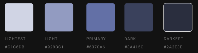
Each color palette includes five color variations: Darkest, Dark, Primary, Light, and Lightest.
Additionally, we have Categorical palettes available in light and dark variants.
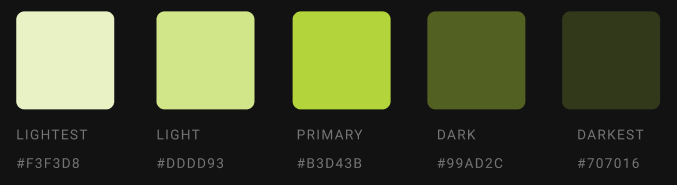
Colors from the Temenos palette are displayed most frequently across our screens and components. Use these colors to highlight UI elements that are important, interactive, and must stand out amongst other elements.
For a balanced interface there are 2 dark and 2 light colors with the primary color in the middle. The primary color has increased brightness and is used to indicate the main CTA action and interactive elements within the UI.
Application of each color in the Temenos palette:
- Darkest - Darkest is used for the main color stripe on the page to help reflect a Temenos branded product. Apart from the navigation rail, this dark dominating color should be used sparingly.
- Dark – Used for most headings and graphical elements that require a good contrast.
- Primary – Used for CTA and interactive elements.
- Light – Used to add subtle structure to the page and elements.
- Lightest – Used for the main background color. It offers a subtle defining edge to large objects like cards.
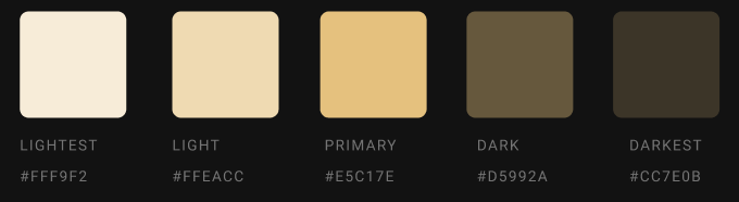
The Grayscale palette gives more emphasis to the Temenos palette and contributes to a UI with less visual noise following the principle of Aesthetics with a purpose.
Like the Temenos palette, the Grayscale palette has five color variations.
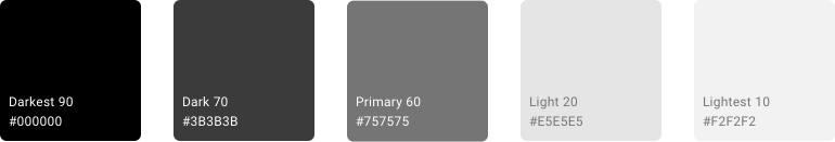
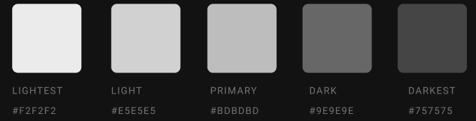
These colors are mainly used for text and inactive elements.
- Darkest – Must be used sparingly, for example, for smaller text.
- Dark – This is the main text choice.
- Primary – Offers good contrast on a white background.
- Light – Mainly used for framing objects and inactive components.
- Lightest – Used for very subtle bigger block areas.
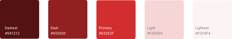
Colors from the Status Positive, Status Negative, and Status Notice palettes are only used in special cases like form validation and messaging. Like the Temenos and Grayscale color palettes, each of the Status palettes consists of five color variations: Darkest, Dark, Primary, Light, and Lightest.
- Status Positive Palette – Use this palette to indicate positive values like passing a verification or a credit balance.

- Status Negative Palette – Use this palette to indicate negative or adverse values like failing a background check or a debit balance.
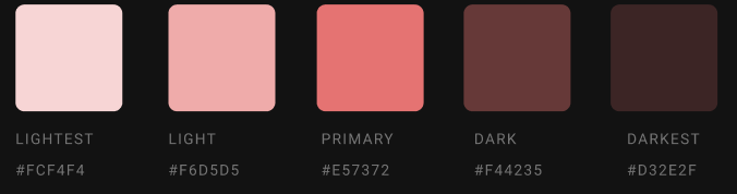
- Status Notice Palette – Use this palette when you need to bring something to the user's attention.
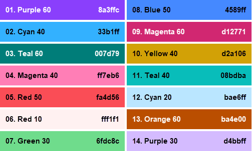
Categorical (or qualitative) palettes are best when you want to distinguish discrete categories of data that do not have an inherent correlation. The colors of this palette should be applied in sequence strictly as shown below. The sequence is carefully curated to maximize contrast between neighboring colors to help with visual differentiation. The Categorical palette is available in variants for use with light and dark backgrounds.
- Light Categorical Palette – Use this palette when the background color is closer to white than black. Remember to apply these colors in sequence strictly as shown.
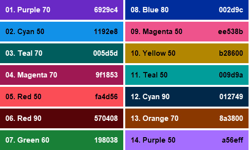
- Dark Categorical Palette – Use this palette when the background color is closer to black than white. Remember to apply these colors in sequence strictly as shown.
- Material Design – Material Foundation > Color > The color system
- Material Design – Material Foundation > Color > Applying color to UI
- Web Content Accessibility Guidelines (WCAG) 2.2, (World Wide Web Consortium, 2018)