uwc-dialog components inform users about a task and can contain critical information, require decisions, or involve multiple tasks.A dialog is a type of modal window that provides critical information or asks for a decision. A modal window appears on top of the main content – which is disabled, often behind a scrim – and moves the system into a special mode requiring the user to interact with the modal window.
Dialogs disable all app functionality when they appear, and remain on screen until confirmed, dismissed, or a required action has been taken. Dialogs are purposefully interruptive, potentially causing the user to forget what they were doing, so they should be used sparingly. Interruptions only help when they are relevant or helpful to the current task.
Use modal dialogs for important warnings, or to prevent or correct critical errors. Whenever there is a chance that a user's work may be lost or that an action may have destructive, irreversible consequences, interrupt the user to avoid a disaster.
Dialogs are also useful to break complex workflows into smaller or simpler steps that are easier to complete. Wizard dialogs are common example of this dialog usage. Keep in mind that breaking a task into more smaller steps may extend the time it takes to complete the task, so provide a progress indicator to help the user have a sense of how much remains and reduce the chance of abandonment.
Another effective use of dialogs is to collect information that is likely to reduce the user's work or effort significantly, a form of progressive disclosure. While this information may not be critical, using a dialog to collect it at a relevant point in the workflow can streamline the data capture process and focus the user on completing the task.
Things to avoid:
- Don't use dialogs to collect information that is not critical to completion of the task at hand – Such dialogs can be perceived by users as annoying as they get in the way of what the user is trying to do and can lead to abandonment.
- Avoid dialogs that interrupt high-stake processes such as checkout flows – While you can use a dialog to focus a user on completing a high-stake process, a dialog that interrupts an important flow can distract the user from completing the flow and even erode the user's confidence.
- Don't require the user to make a decision in a dialog when that decision is based on information not immediately available in the dialog, especially if the decision is complex or requires additional research.
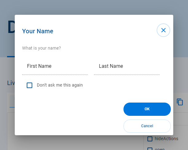
The following image shows four tabs.
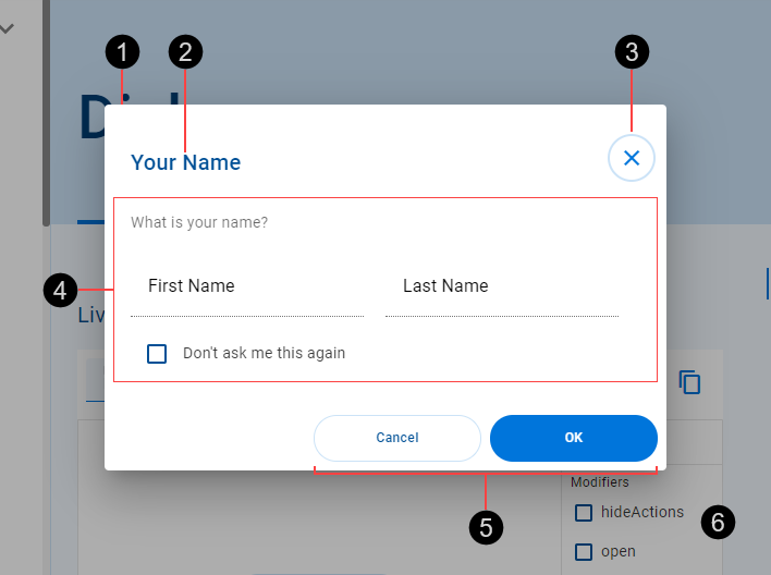
- Container
- Title
- Close button (optional)
- Content – Specific to dialog instance
- Action buttons (optional)
- Scrim
The optional close button appears in the top right corner of a dialog. Click the close button to close the dialog.
Action buttons are optional. When configured, they appear at the bottom of the dialog. Clicking an action button initiates a related action and closes the dialog.
Scrims are temporary treatments that can be applied to surfaces for the purpose of making content on a surface less prominent. They help direct user attention to other parts of the screen, away from the surface receiving a scrim. Dialogs appear on top of a scrim placed over the entire page and which prevents user interaction with the main content.
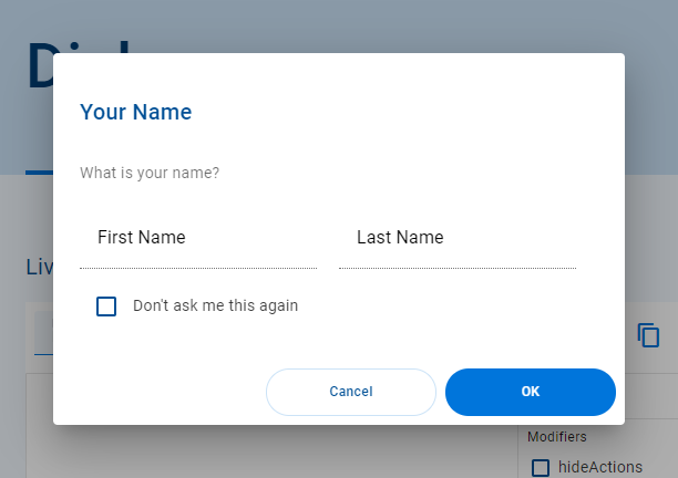
Action buttons can be stacked. The order of stacked action buttons from top to bottom is the same as unstacked action buttons from right to left.
Closing a dialog hides it and returns focus to the main content. A dialog can be closed by any of the following actions.
- Clicking the Close button, if available.
- Clicking an action button, if available.
- Clicking outside the dialog, on the scrim.
Clicking an action button initiates an associated custom action, in addition to closing the dialog.
- Dialogs should be used sparingly for high importance items as they are disruptive and block an app's normal operation until an action is confirmed.
- Use to obtain critical information for a task, or gain a user's decision or acknowledgement.
- Don't use for medium or low priority information. Instead use the uwc-notification-panel to present snackbars that disappear automatically.
- Titles should contain a brief and clear statement or question.
- Don't use dialog titles that contain apologies, extra alarm or ambiguity.
- A single action may be used only for acknowledgements.
- A confirming action and a dismissing action may be provided in other circumstances. Avoid more than two actions.
Our components have been designed to comply with the WCAG 2.2 AA accessibility guidelines.
- When the dialog opens, focus goes to the first interactive element.
- Tab key lands focus on the next interactive element contained in the dialog. Focus does not leave the dialog.
- Escape key closes the dialog. Focus is returned to the calling element on the calling page.
- Space / Enter key actions the focussed element.
- Shift + Tab key lands focus on the previous interactive element. Focus does not leave the dialog.
The <uwc-dialog> component inherits from mwc-dialog (Material Web Components).
- Material Design – Components > Dialogs
- Material Design – Design > Environment > Surfaces > Attributes > Scrim
- Therese Fessenden, Modal & Nonmodal Dialogs: When (& When Not) to Use Them (Nielsen Norman Group, 2017)