uwc-menu-button components let the user choose an item from a list.Our design system distinguishes two menu button types for specific needs.
- Outlined
- CTA (Call To Action)
Menu buttons are low-emphasis outlined or high-emphasis CTA buttons that let the user choose an item from a list or a value from a dialog or picker. For example, you can use a menu button with dynamic date for a date field in your UI. Menu buttons can include a leading or trailing icon.
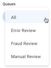
Sub menus can be added to menuItems by adding an array of items with the key "submenu" to an item. Note: the sub-menus are currently not keyboard accessible.
If there are a large number of menu items, the popup will automatically create a scrollable list, except in the case where there are submenus. In this situation, the overflowing items are visible (shown outside of the popup). This is a current limitation of the component, which will be addressed later.

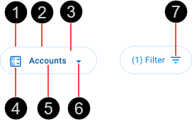
- Container
- Border
- Fill
- Leading icon (optional)
- Text label
- Menu icon
- Trailing icon (optional)
Use a menu button with leading icon when you need the user to choose an item from a small, fixed list of items.
Use a menu button with trailing icon for actions that require multiple values to be applied simultaneously in your application.
Menu buttons are interactive components that respond visually to user actions and system-initiated events.
Menu buttons are Interactive components that provide visual feedback when the pointer hovers over them.

Enabled (top) and hover (bottom) states for menu buttons with leading icon (A), trailing icon (B), and dynamic data (C) icon buttons. The key visual differences are a thicker border and a bottom shadow in the hover state.
The primary action area of a menu button is the button surface. Press a menu button to display a menu, item list, dialog, or picker that may obscure the menu button.

Selecting an item from a menu or item list or closing a dialog or picker hides the menu, item list, dialog or picker, and reveals the menu button again. If a menu button is in the disabled state, no action will take place.
Our menu buttons have been designed to comply with the WCAG 2.2 AA accessibility guidelines. For information about how our design system complies with color-related accessibility guidelines, see Foundations > Colors > Accessibility.
For more information about menu buttons, see:
- Material Design – Components > Menus > Exposed dropdown menus.
Related components: