uwc-tree component is a tree based view on a array of javascript objects.A tree requires the developer to pass in an array of javascript objects (with at least a "label" field in each object) in to the "treeItems" property. These objects are then rendered as a tree. To create a heirarchy (tree nesting), an array of children can be added to an object under the field name "childItems".
Clicking on a leaf item triggers a "treeAction" event. The event.detail will indicate which item has been clicked (either by sending the "actionId" field value or a random number if one wasn't set). A payload is also returned, which can be passed in as part of each object in the "detail" field.
Clicking on a node to expand/collapse a branch triggers a treeChange event, passing the new state of the node and the nodeId in the detail of the event object.
The icons used for the expand/collapse state of a node change be changed by setting the iconState property. This can either be an object with a single "icon" field, or an object with an "opened" and "closed" field.
Individual tree items can be hidden with the "hide" field. This can either be a boolean, or a function (which returns a boolean)
The tree control respects the "disabled" attribute and the "dense" attribute. Right to left is also suppoted out of the box.
Keyboard navigation is supported (using up/down arrows to move and spacebar/enter to expand/collapse a node).
It is possible to add a 'badge' to any element of a tree (leaf or node) by adding a badge object. This object should have a value
field, and optionally color (background color), textColor (text color) and position ("endOfLabel" or "endOfRow" (default)). This position of
an individual badge overrides a default which is set by the badgePosition property (same options as in the badge object).

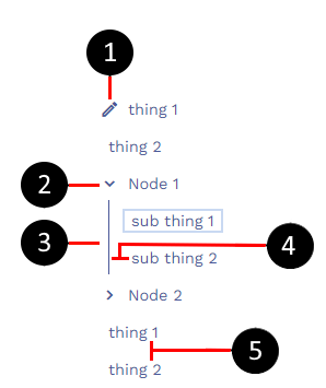
- Optional item icon
- Branch icon (can be at start or end of label)
- Nested indicator (can be hidden)
- Indentation of subtrees (set with --uwc-tree--subtree-items-indentation)
- Row spacing (set with --uwc-tree---row-spacing)
Sub trees are created by adding an array of tree items to an existing item, in the "childItems" field.
Clicking on a tree item will emit a "treeAction" event, whose detail field includes an actionId (either passed in or auto-generated) and a payload (which can be passed in to the tree item (in the "detail" field))
Our components have been designed to comply with the WCAG 2.2 AA accessibility guidelines. For more information about how our design system complies with color-related accessibility guidelines, see Foundations > Colors > Accessibility.
Related components: