uwc-text-area components are text fields for longer input.Text fields are the main way a user enters text information. When you need to accommodate longer input, use a text area component instead.

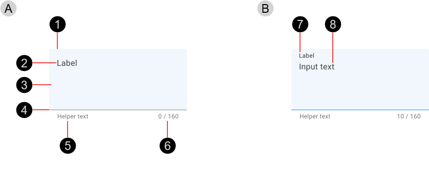
- Empty text area
- Container
- Label – Describes the type of information captured and displayed in the text field
- Fill – Some states change the fill color
- Activation indicator – Color and width vary according to current state
- Helper text (optional)
- Character count (optional)
- Filled text area
- Label – Moves to the top of the control when filled
- Input text – Text entered by the user.
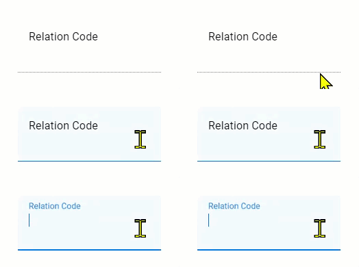
Texts are Interactive components that provide visual feedback when the pointer hovers over them.

Text areas showing enabled (A) and hover (B) states. The key visual differences are a thicker activation indicator and darker colors (fill and activation indicator) in the hover state.
Text areas include a label in place of the input text. When an empty text area becomes focused, the label is animated moving to the top and reducing the font size.

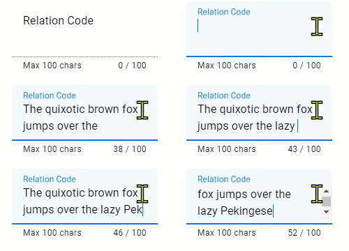
If a text area is configured to restrict input size, the number of characters entered and the maximum number of characters accepted are displayed beneath the activation indicator. As the user types, the number of characters entered is updated.

Text areas can be configured to autogrow to fit the text content, but user-actioned resize via a handle is not available.
Our text fields have been designed to comply with the WCAG 2.2 AA accessibility guidelines. For information about how our design system complies with color-related accessibility guidelines, see Foundations > Colors > Accessibility.
Our text area is based on the Material Design text field component. For more information about text fields, see:
- Material Design – Components > Text fields > Input types
- Material UI – Components > Inputs > Text Field > Multiline
Related components: