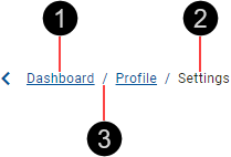
uwc-breadcrumb components are a type of secondary navigation that reveals the user's location in a web application.Breadcrumbs inform the user of their current location in a hierarchy and provide a way to navigate quickly to a parent level or previous step. It's a compact navigation component used as a secondary navigation aid and should never be more prominent than the primary navigation. Avoid breadcrumbs wrapping onto a second line.
Use breadcrumbs for navigation when your application has more than two levels in its navigation hierarchy. Don't use breadcrumbs if your application has a flat navigation structure.
Our design system distinguishes several breadcrumb variations for specific needs, including large and light formats as well as the default breadcrumb. To learn about breadcrumb variations, see Formatting.

- Page link
- Inactive page link
- Separator
To avoid breadcrumbs becoming too long, or when space is limited, replace excess page links with an ellipsis.

Always display the first and last two page links and replace the rest with an ellipsis.
If you need to provide access to the replaced page links, consider using the ellipsis to provide access to a menu containing the replaced page links.
This is the default breadcrumb format, displaying a hierarchy of page links, divided by separators. If required, page links can be made inactive.

Position breadcrumbs near the top of the page, below a page header but above the page title.
The basic breadcrumb is designed to be displayed on a light-colored background. If you need breadcrumbs on a dark-colored background, use the light breadcrumb instead.
Large breadcrumbs use a larger font size (16px / 24px for the last page link) but otherwise can be configured and behave the same as basic breadcrumbs.

Use large breadcrumbs when your UI prefers a larger font. However, avoid large breadcrumbs if they are the most prominent navigation component in your design.
The light breadcrumb uses a light font color but otherwise is the same as the basic breadcrumb.

Use the light breadcrumb when it is displayed on a dark-colored background.
Any page link can be made inactive to prevent navigation interaction; for example, the last page link should be inactive when it refers to the current page. This is done by setting the activeIndex to be the index of this option.

Our components have been designed to comply with the WCAG 2.2 AA accessibility guidelines. For information about how our design system complies with color-related accessibility guidelines, see Foundations > Colors > Accessibility.
For more information about breadcrumbs, see:
- Angular Material – Components > Badge
- Material UI – Components > Navigation > Breadcrumbs
Related components: