uwc-chip-group components are compact elements that allow users to select a choice, filter content, or trigger an action.Chips are multi-purpose components that can be used for input, to represent attributes, or to initiate actions. Our design system distinguishes three chip types for specific needs.
- Input chips
- Choice chips
- Filter chips
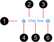
- Container
- Border
- Fill
- Icon
- Text label
- Trailing icon (optional)
Our chips are based on Material Design chips.
- Input chips represent complex data items. They are input components, accepting typed text or selection from a list, and verify their input by converting it into chips. For more information, see Material Design > Components > Chips > Input chips.
- Choice chips allow selection of a single chip from a set of options. They are a compact alternative to radio buttons. For more information, see Material Design > Components > Chips > Choice chips.
- Filter chips use tags or descriptive words to filter content. They support multi-selection and are a compact alternative to checkboxes. For more information, see Material Design > Components > Chips > Filter chips.
Chips are available in normal (medium) and compact (small) sizes. Chip size is based on an integral number of nudges, where 1 nudge is 8px ( ). Compact chips use a smaller font.
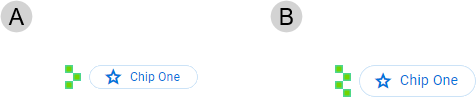
- Small – Based on a height of 3 nudges (24 px)
- Medium – Based on a height of 4 nudges (32 px)
Chips can use color to represent different kinds of status.
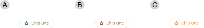
- Status Positive
- Status Negative
- Status Notice
The chips in a chip group are arranged horizontally within the containing component (such as a text field).

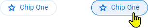
Chips are interactive components that respond visually to user actions and system-initiated events.
Chips provide visual feedback when the pointer hovers over them.
Our components have been designed to comply with the WCAG 2.2 AA accessibility guidelines. For more information about how our design system complies with color-related accessibility guidelines, see Foundations > Colors > Accessibility.
For more information about chips, see:
- Material Design – Components > Chips
- Material UI – Components > Data display > Chip
Related components: