Use Flex Table
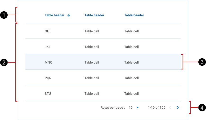
uwc-table component is deprecated. Use uwc-flex-tableTables organize datasets in a way that's easy to scan so that users can look for patterns and develop insights from data. The table component presents information from a dataset as a grid of values arranged in rows and columns. Tables can be embedded in primary content, such as cards. The table's basic elements include a header row, data rows and pagination.
Our table component is based on the Material Design data table.

- Header row – Describes the type of content displayed in each column with optional sorting behavior. The header row is visually distinguished from the data rows. Headings for sortable columns react to the cursor and change their appearance when clicked.
- Data rows – Each data row contains data related to a single entity. These can be configured to show different types of data. Data rows can be selectable.
- Row highlight – Data rows react to the cursor position with the hover behavior. The visual appearance of highlighted rows distinguishes them from other rows.
- Pagination controls – Allows the user to navigate data as pages when the dataset is too large to be shown at once.
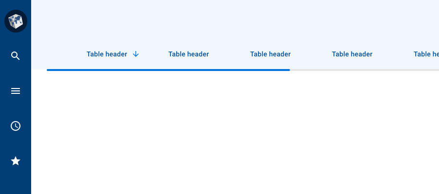
The loading bar (1) is a linear progress bar expressing an unspecified wait time while fetching data to populate the data rows.

The loading bar is an indeterminate indicator expressing an unspecified wait time while fetching data to populate the data rows. Although it does not provide details about what is occurring on the backend or how long it will take, displaying a loading bar reassures the user that their action is being processed. The loading bar is always placed immediately below the table's header row.

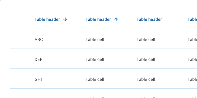
Table data rows can be sorted in ascending or descending order of the values in one or more columns. An arrow appears temporarily beside the header of a sortable column when you point the cursor at the column's header. A persistent arrow icon next to a column header indicates that the table is sorted by that column. Click a column header or sort icon to change the sort order.
A sorted table has three states: unsorted (no arrow), sorted-ascending (up arrow) or sorted-descending (down arrow). The icon indicates the current sorted state and is only shown if sorting is activated. Only the column being sorted displays a persistent icon; other sortable column headers show an icon only on hover.

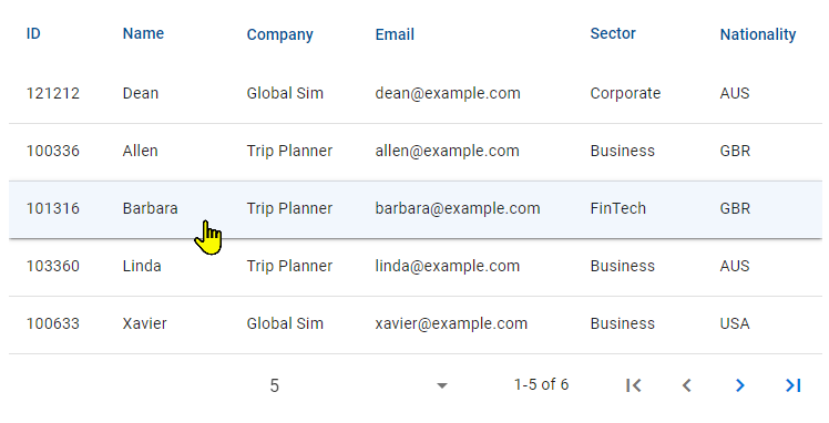
When a user hovers over a data row, the row changes its background color.

When a user hovers over a column header, the cursor changes to the hand cursor, thereby indicating that the header can be clicked to sort by that column.

Pagination behavior is described in Material Design. For details, see Pagination in Material Design > Components > Data tables > Behavior.

Our inputs have been designed to comply with the WCAG 2.2 AA accessibility guidelines. For more information about how our design system complies with color-related accessibility guidelines, see Foundations > Colors > Accessibility.
For more information about data tables, see
- Material Design – Components > Data tables
- Material UI – Components > Data Display > Data tables