uwc-date-picker component is an inline date picker that contains a text field that opens the uwc-date-calendar.The date picker is an input component that provides access to a calendar dialog where the user can select a fixed date. The date picker uses a compact design to improve usability on various devices.
If the date picker doesn't include all the features you need, consider using one of our other date-related picker components.
- Date Relative Picker – Select a fixed or relative date.
- Date Frequency Picker – Define and select a frequency pattern based on a start date and a period-based frequency type.
- Date Recurrence Picker – Define and select a recurrence pattern based on a period-based recurrence type.
- Date Period Picker – Define a period during which an event should occur
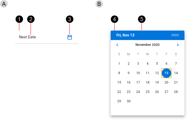
The date picker component is a compound component consisting of a text field that provides access to a date calendar.

- Text field
- Text field component with trailing icon
- Text label / Input text – The text label replaced with input text when a date is typed or selected.
- Dialog icon – Provides access to the calendar dialog.
- Calendar dialog
- Dialog component
- Date calendar component
The calendar dialog is composed of a date calendar component in a dialog component. To learn more about the date calendar and dialog components, see Date calendar and Dialog.

Date relative pickers are available in normal (medium) and dense (small) sizes. Date relative picker size is based on an integral number of nudges, where 1 nudge is 8px ().

- Small – Based on a height of 5 nudges (40 px)
- Medium – Based on a height of 7 nudges (56 px)
Real time validation helps to streamline the data entry process and keep data clean. When a date picker's input text doesn't represent a well-formatted date, display error text with instructions on how to fix it. For more information see Text field > Formatting > Validation and errors.
Error text is displayed below the text field's activation indicator, replacing any helper text until fixed. When an error is displayed, elements use colors from the Status Negative color palette.

Date pickers are interactive components that respond visually to user actions and system-initiated events.
Date pickers provide visual feedback when the pointer hovers over them.

- Hover over text field
- Hover over dialog icon
Our components have been designed to comply with the WCAG 2.2 AA accessibility guidelines. For more information about how our design system complies with color-related accessibility guidelines, see Foundations > Colors > Accessibility.
The date picker component is composed from our Text Field, Dialog and Date Calendar components. For more information about these components, see:
Related components: