uwc-switch components toggle the state of a single item on or off.Switches allow the user to change the state of a single item from on to off and vice versa. While they are the preferred way to adjust settings on mobile UIs, switches are equally well-suited to desktop UIs.

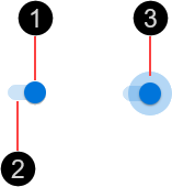
- Thumb
- Track
- Ripple – Visual feedback on user interaction

The switch container is 5 nudges (40px) wide by 3 nudges (24px) high.

Switches are interactive components that respond visually to user actions and system-initiated events.
Switches provide visual feedback when the pointer hovers over them.

Switches provide visual feedback when pressed, in the form of a radial ripple around the thumb.

The primary action area of a switch is the switch surface. Press a switch to change it from off to on and vice versa. If a switch is in the disabled state, pressing it has no effect.

Our components have been designed to comply with the WCAG 2.2 AA accessibility guidelines. For more information about how our design system complies with color-related accessibility guidelines, see Foundations > Colors > Accessibility.
For more information about switches, see:
- Material Design – Components > Selection controls > Switches
- Material UI – Components > Inputs > Switch
Related components: