uwc-date-calendar components let users select a date from a calendar.The date calendar is an input component that allows the user to select a fixed date. The date calendar can be displayed inline or in a dialog, and in portrait or landscape orientations.
If you don't need an inline date input component or don't have space for it in your UI, consider using a Date Picker instead.
The date picker component is a compound component consisting of a text field that provides access to a date calendar.
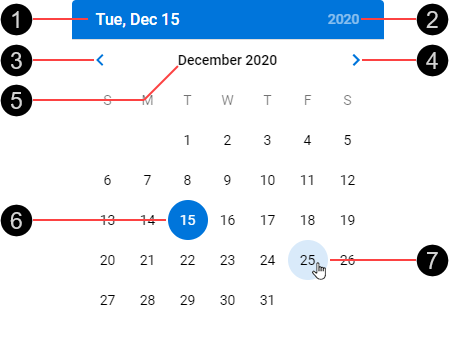
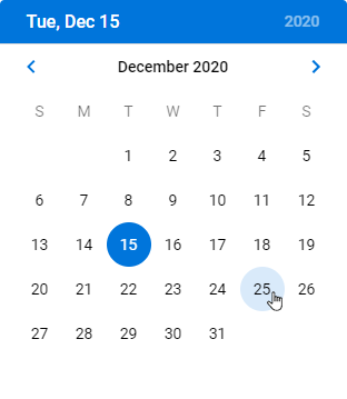
- Selected date
- Year selector
- Previous month
- Next month
- Month and year label
- Selected date
- Hover state
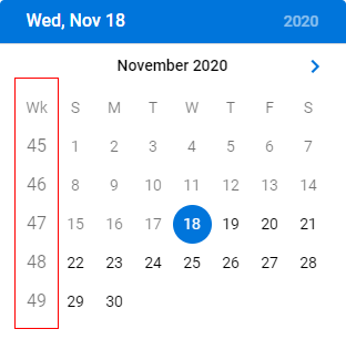
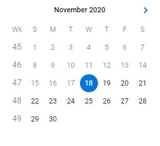
Week numbers can be included in the calendar view.
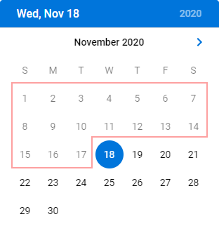
Days that are in the past are shown on the calendar in a light gray font.
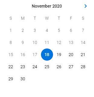
The inline layout removes the top bar that contains the selected date and year selector. Use the inline layout when you need the user to select a date near the current date.
The inline layout can include week numbers.
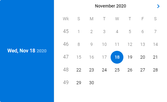
The landscape layout moves the top bar containing the selected date and year selector to the left side. Use the landscape layout in UIs that respond to a change in device orientation.

The landscape layout can include week numbers.
Date calendars are interactive components that respond visually to user actions and system-initiated events.
Date calendars provide visual feedback when the pointer hovers over them.
Our components have been designed to comply with the WCAG 2.2 AA accessibility guidelines. For more information about how our design system complies with color-related accessibility guidelines, see Foundations > Colors > Accessibility.
Related components: