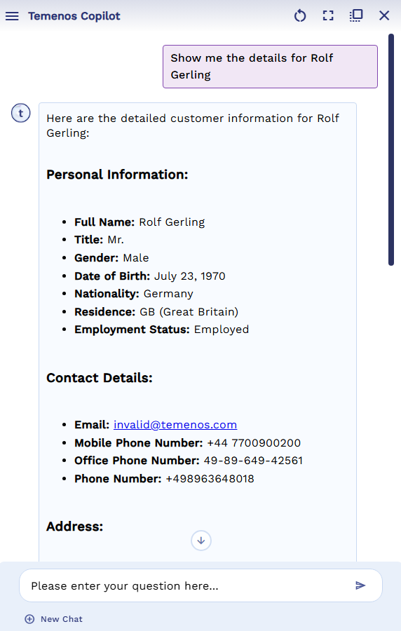
uwc-chatbot component renders a UI shell for AI-driven conversations via Temenos chat APIs.The chatbot uux component provides a uux based front end for the Temenos AI chat APIs. The component itself is dumb - that is, it doesn't attempt to answer any questions, or query previous answers.
Configuration of the chatbot uux component is via the configuration property. The structure of this
is described below:
- authToken: (string) auth token string from SSO (e.g. keycloak token)
- streamMode: ("true" | "false" | "chat")
"true" should be used where the server is set up to send Server Sent Events (SSE), giving some indication of progress
"false" should be used where the server is set up to send a single response object
"chat" should be use where the "conversation" model is used on the server. This keeps track of previous questions and answers in a session (on the server) to provide context - sqlExecutionEP: (string) the api end point where the payload is processed
- title: (string) Title on the landing page of the chat window
- subtitle: (string) Subtitle on the landing page of the chat window
- initialResponse: (string) first response from "chatbot" - e.g. "How can I help you?"
- showInsights: ("true" | "false") - whether or not to generate the insight text as part of the response. This can have a performance impact if generated.
- allowTextInput: ("true" | "false") whether to allow free format text input field to ask questions (as opposed to having preconfigured questions only)
- autoOpen: ("true" | "false") specify "true" if the chat window (vs. the chatIcon) should be displayed initially
- chatIcon: settings for the chat icon which triggers chat window visibility
- suppress: ("true | "false") specify "true" if the client application is taking responsibility for rendering the chat icon (and the chatbot component should therefore refrain from rendering its own)
- position: (object) setting x and y in px (from bottom right corner of page) e.g. position: {x: "100px", y: "100px"}
- size: (object) setting width and height in pxe.g. size: {w: "100px", h: "100px"}
- bgColor: (string) color to fill the chat icon with
- icon: (string) name of the icon to use
- iconSize: (string) the size of the icon ("small", "medium", "large")
- botResponseImages: (object) optional configuration for custom bot response images
- botLoadingImagePath: (string) custom image path for bot loading state
- botThinkingImagePath: (string) custom image path for bot thinking state
- imageHeightPixels: (number) optional custom height for bot images (defaults to 40px)
- chatWindow: settings for the chat window pane itself
- title: (string) Toolbar title in chat window
- showToolbar: ("true" | "false") specify "false" if toolbar is not required
- isResizable: ("true" | "false") specify "false" if horizontal resizer is not required
- defaultToFullScreenMode: ("true" | "false") specify "true" to default to full-screen mode (see fullScren below)
- toolbar: array of icon button names - pick from "clearChat", "toggleFullScreen", "toggleDock", "closeChat"
- zIndex: (string) set the chat window's z-index
- fullScreen: (object) settings for when the window is maximized
- zIndex (string) sets the z-index for full-screen mode (overrides default z-index)
- insets (object) set left, right, top, bottom insets to limit full screen mode - e.g. if you want to still see a side menu
- responseProcessor: ( (resp) => return resp) call back function to modify the response
- responseConfiguration: (object) configure the response options
- postAnswerButtons: (object) control what levels of detail can be viewed by the end user
- edit, explain, export, table, changeChartType - "true" or "false"
- postAnswerButtons: (object) control what levels of detail can be viewed by the end user
- examples: (array of objects) predefined prompts which the user can trigger from either the side menu, or optionally, home screen
- promptText: (string) The prompt to send
- includeInStartPage: (boolean) Whether to include on home page or not
- tags: (array of strings) - not used, but intended to help searching when there are a lot of examples
- parameters: (object) when the prompt text contains a parameter - indicated by {{paramName}}, configuration of parameter defined here
- name: (string) name of parameter in the prompt text this sets up
- type ("List" | "Integer" | "Text" | "Decimal" | "Date")
- options (string) comma separated list of values to use when type is "List"
**Note: the UUX chatbot bundle is separate from the core UUX web bundle. It is standalone (i.e. the core library is not required), but the base.css file is required
The following is a screenshot of the chatbox UUX component in action:

Our components have been designed to comply with the WCAG 2.2 AA accessibility guidelines. For more information about how our design system complies with color-related accessibility guidelines, see Foundations > Colors > Accessibility.
For more information about cards, see:
- Material Design – Components > Card
- Material UI – Material UI > Components > Surfaces > Card
For information about related components, see: