uwc-text-field components let users enter and edit text.Text fields are the main way a user enters text information on a page or in a dialog or modal window.
We recognize several distinct input variations through content options.
- Without labels – A compact version of the standard inputs
- With icon button – Extend an input with access to custom actions
- With leading icon – Indicate expected data type and/or add custom action
- With trailing icon – A compact input with access to custom action
Our text fields have built-in types such as password, search and number with their associated validations as defined in HTML5.
Our text field is based on the Material Design text field component.
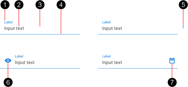
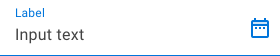
- Label – Describes the type of information captured and displayed in the text field.
- Input text – Text entered by the user.
- Fill – Some states change the fill color.
- Activation indicator – Color and width vary according to current state.
- Leading icon – Optional
- Trailing icon – Optional
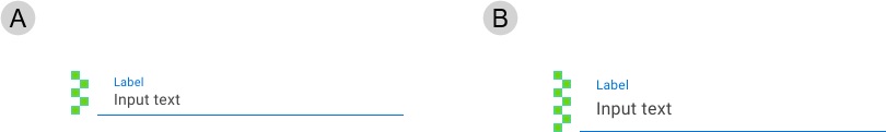
The standard text field (A) includes a label in or above the data entry area. The text field without label variation (B) provides a less-cluttered alternative to the standard text field.
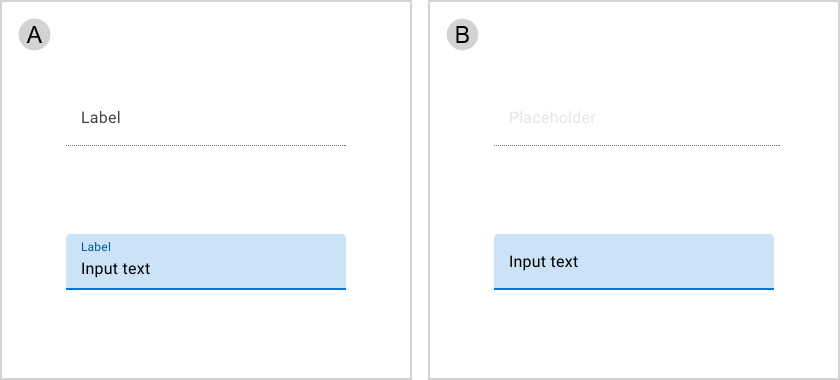
- Standard text field – empty and inactive (top), filled and focused (bottom)
- Text field without label (with placeholder text) – empty and inactive (top), filled and focused (bottom)
The text field with icon button variation extends a standard text field, adding a standard icon button on the right. This composite component provides a convenient alternative to using separate text field and icon button components.
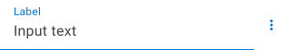
Use a text field with icon button as an alternative to a standard text field when you need to capture text and provide some options related to it.
Icon buttons change their position based on LTR or RTL contexts.
The text field with leading icon variation extends a standard text field component, adding an icon before the input text. This composite component type provides a compact alternative to using separate text field and icon components.
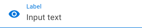
Leading icons may signify the input type required or provide access for additional functionality. For example, a calendar icon indicates the text field accepts dates and may be used to reveal a date picker.
Use a text field with leading icon as a compact alternative to the combination of a standard text field and an icon in these scenarios.
- When you want to indicate the expected data type.
- If you need to capture text and associate some functionality with it.
Leading icons change their position based on LTR or RTL contexts.
The text field with trailing icon variation extends a standard text field, adding an icon after the input text. This composite component type provides a compact alternative to using separate text field and icon components.
Trailing icons provide access to additional functionality (such as clearing the text field's content) or may signify valid input methods (such as a microphone icon).
Use a text field with trailing icon as a compact alternative to the combination of a standard text field and an icon If you need to capture text and associate some functionality with it.
Trailing icons change their position based on LTR or RTL contexts.
Text fields are available in normal (medium) and high-density (small) sizes. Text field size is based on an integral number of nudges, where 1 nudge is 8px ( ).
).
- Small – Based on a height of 5 nudges (40 px)
- Medium – Based on a height of 7 nudges (56 px)
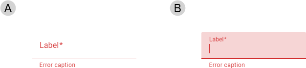
Real time validation helps to streamline the data entry process and keep data clean. When text input isn\'t accepted, display error text with instructions on how to fix it.
All text field variations can display errors for all states except disabled and read-only. Filled text fields validate the input text while empty text fields validate attributes such as mandatory data.
For more information about how text fields deal with errors, see:
- Material Design – Assistive elements and Error text in Components >Text fields > Anatomy
- Material UI – Components > Inputs > Text Field > Validation
Error text is displayed below the activation indicator, replacing any helper text until fixed. When an error is displayed, elements use colors from the Status Negative color palette.
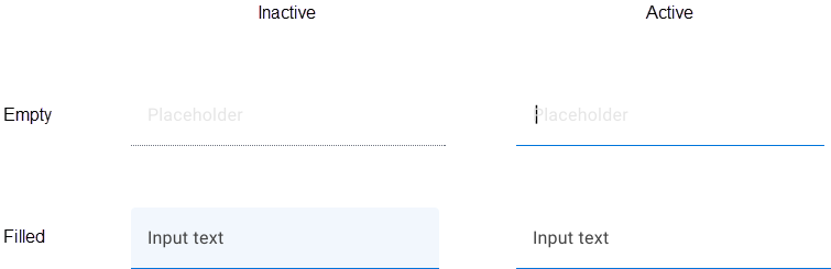
- Active
- Focused
Placeholder text provides a hint or example of what to enter. Make the text a direct statement without punctuation, using sentence case, and not containing any crucial information. When the user begins typing in the text field, placeholder text disappears or transforms into a label above the input text.
Placeholder text is implemented using the
placeholderattribute inherited from themwc-textfieldbase component.
- Don’t truncate label text. Keep it short, clear, and fully visible.
- Label text shouldn’t take up multiple lines.
- When using both filled text field and outlined text fields in a UI, separate them by region. Don't use them next to eacht other within the same form.
- Don’t use fixed text field margins on large devices. Text fields shouldn’t span the full width of a large screen.
Our text fields have been designed to comply with the WCAG 2.2 AA accessibility guidelines.
- Error messages are displayed in an aria-live area beneath the field so that they visible without hover and are announced by screen readers.
- Use the textonly attribute rather than the readonly attibute to present non-editable data as this won't be a tabstop during keyboard navigation.
- Tab key places focus on (non-disabled) text field
The <uwc-text-field> component inherits from mwc-text-field (Material Web Components), which itself extends the native HTML <input> element.
- Supports most standard
<input>attributes and properties. - Behaves like an
<input>field with added styling and functionality frommwc-text-field. - Can be used interchangeably with an
<input>in terms of data binding and form submission.
For more information about text fields, see:
Related components: