The uwc-grid responsive layout grid adapts to screen size and orientation, ensuring consistency across layouts.
A good component layout is important for creating a great user journey. How you position components in your design can be the difference between a positive or a negative user experience. With grids, you can position components in containers in a way that lets them respond gracefully to changes in screen size, so your UI design always looks great and performs well.
Unified UX defines four responsive breakpoints, creating five standard screen sizes – extra-small (xs), small (sm), medium (md), large (lg), and extra-large (xl). Since modern devices are available in many sizes and can be rotated to portrait or landscape orientations, the standard screen widths are only indicative of actual devices. However, the five screen sizes roughly equate to: smartphone (xs), tablet (sm), laptop or small desktop monitor (md), standard desktop monitor (lg), and super- or ultra-wide desktop monitor (xl).
The basis of a responsive layout is the division of containers into 12 columns. 12 is a useful number because it can be divided evenly in halves, thirds, quarters and in other ways, making it flexible but simple. Each component can be configured to use any number of columns, from 1 to 12, which in turn determines the component\'s width.
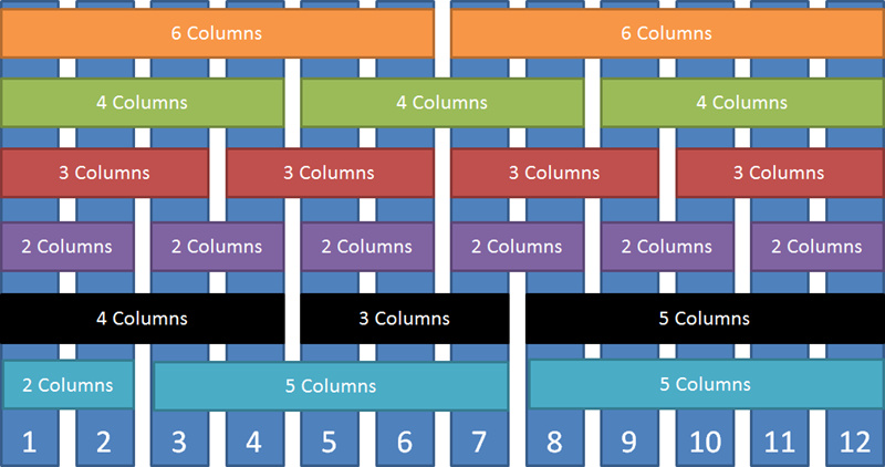
This approach to layout means the screen or container size will always equate to 12 columns, no matter the actual pixel width. The only thing that changes is the width of the columns. For example, dividing 12 columns across a 1200 pixel screen produces columns of width 100 pixels while a 600 pixel screen has 50 pixel columns, half the width of the smaller 600 pixel screen.
Grids encapsulate the responsive breakpoints and 12-column layout in a container component that makes it easy to position other components in a responsive layout.
Grids allow you to configure the following aspects of components in your design.
- The width in columns of each component.
- The location of components relative to each other.
- The adjustment of component positions when the overall width of the screen changes.
With a grid, you define how many columns each component occupies at each of the supported screen sizes. Using a grid inside a container allows you to size and position components relative to one another in a manner that will take advantage of responsiveness as the screen is resized or when your application is viewed on different screen sizes.
Withing a grid, you can continue to place components to the right of other components and allocate a width in columns as desired. However, as soon as the total column count of all the components on a row exceeds 12, that component and any subsequent components will move to the next row. For example, to get two equal text fields on one line, set both text fields to 6 columns wide. If instead you set one text field to 5 columns wide and the other to 7 columns wide, then the two text fields will still appear on the same row. However, if you set one text field to 6 columns wide and the other to 7 columns wide, then the second text field will appear on a separate row.
Justification controls how space is distributed between and around components in a grid row.
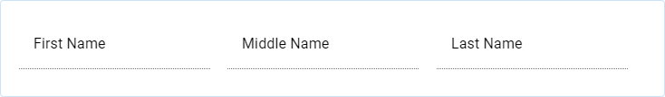
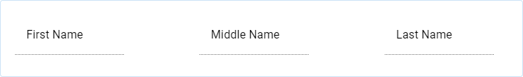
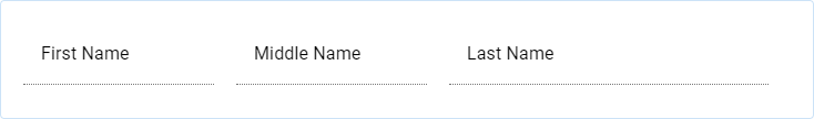
When the components in a grid have widths that sum to 12, justification has no effect. For example, here is a card containing a grid with three text fields and each text field is four columns wide
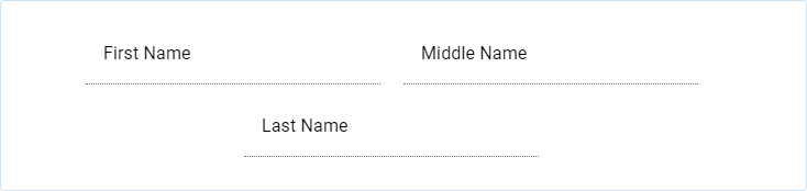
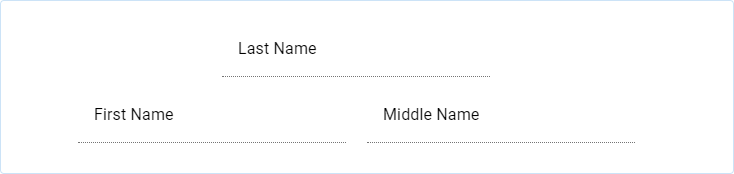
When a grid includes components with widths that sum to less than 12, you can use justification to position components in the grid row in different ways. The supported justification options are demonstrated below using a card containing a grid with three text fields where each text field is three columns wide.
Center – Components are centered in the card with space distributed evenly on the left and right\

Start – Components are positioned at the start (left in an LTR context) of the card\

End – Components are positioned at the end (right in an LTR context) of the card\

Space between – Space is distributed evenly between the components, no space at start or end\
Space around – Space is distributed evenly around the components\

Space evenly – Space is distributed evenly around and between the components\

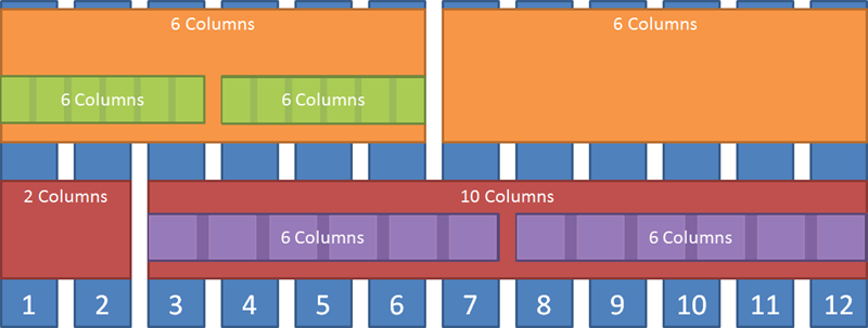
Wrapping controls how components are positioned in multiple grid rows when the widths of the components in a grid sum to more than 12. The supported wrapping options are demonstrated below using a card containing a center-justified grid with three text fields where the first two are three columns wide and the third is seven columns wide.
No wrap – Component sizes are adjusted so that all components in the grid fit in one row\
Wrap – Components in the grid are positioned in a row until the total column count of components in the grid exceeds 12, at which point that component and any susequent components move to the next row\
Reverse wrap – Like Wrap but counting columns from the last component to the first\
- Material Design – Design > Layout > Responsive layout grid
- Material UI – Components > Layout > Grid
- Grid MasterClass Video; confluence.temenos.com