The Unified UX (UUX) design system is based on a set of design principles covering fundamental aspects such as layout, typography and color. The Golden Form illustrates how these aspects are related and describes guidelines that you should consider when designing a UUX-based solution. Developers may also find the Golden Form useful in understanding how components in a UUX-based design relate to one another, in particular in regard to positioning and spacing.
The Golden Form is implemented as a set of Sketch artboards, each one focused on a separate aspect of design.
In these artboards, instructional text describing aspects of the design appears like THIS to differentiate it from text that's part of the design.
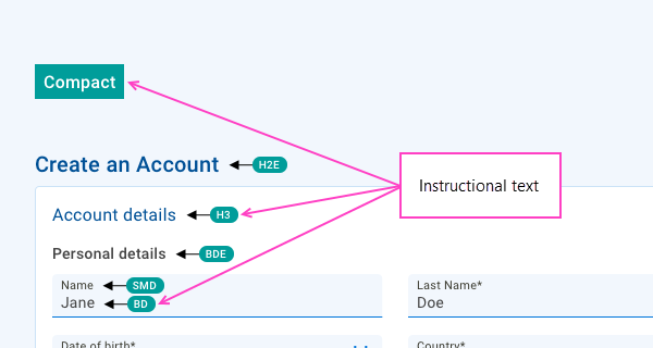
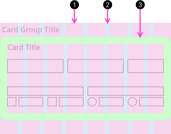
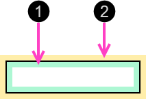
Also, numbers like this 1 are used in artboards to refer to specific elements in the artboards. While these numbers are unique within each artboard, they are re-used across the various artboards. Similarly formatted numbers in the documentation below correspond to the same numbers in a specified artboard.


Component Spacing (Padding and Margins) Artboard
Responsive Layout (Columns, container spacing) Artboard
Layout designs are based on a responsive layout grid. To learn more, see Responsive layout grid.
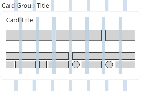
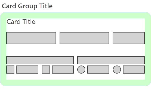
Containers, such as cards, are arranged on the layout grid per the desired design. Components are, in turn, arranged and grouped within containers. Some examples are shown in the Responsive Layout artboard, demonstrating how a component layout within a container resizes as the container itself is resized to fit a different number of page columns.
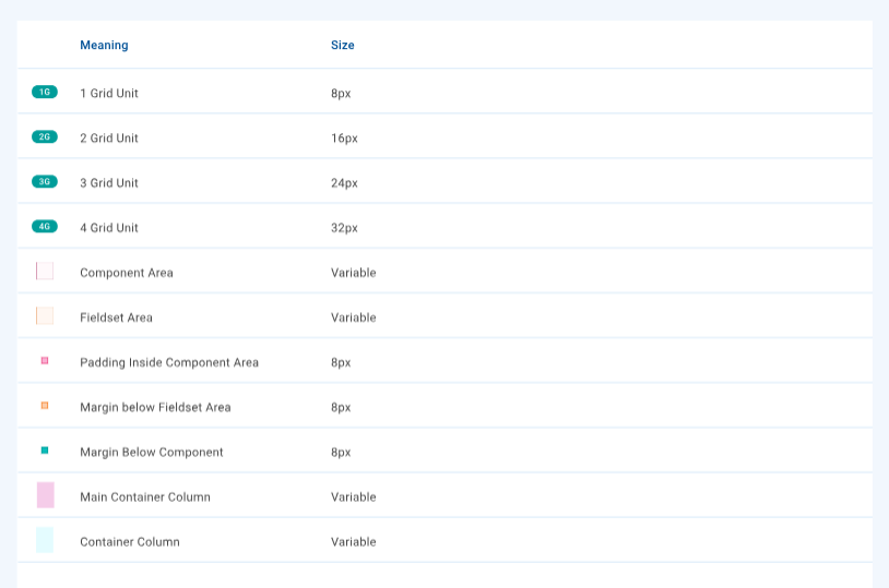
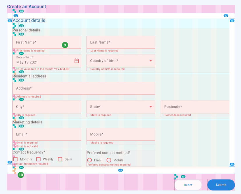
Grid spacing is defined in terms of grid units (G) where 1G is 8 pixels.
- 2G is 16 pixels
- 3G is 24 pixels
- 4G is 32 pixels
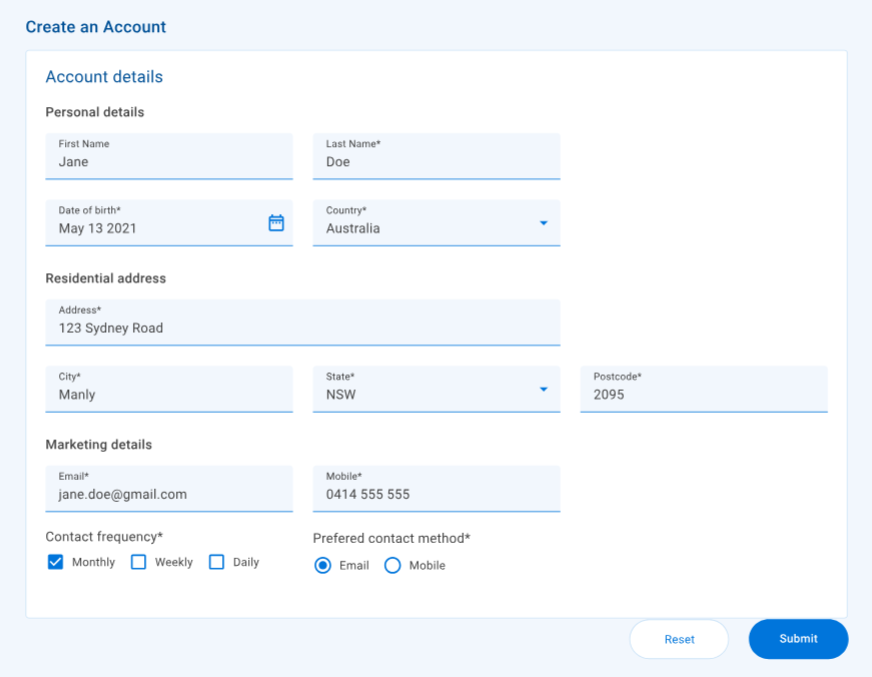
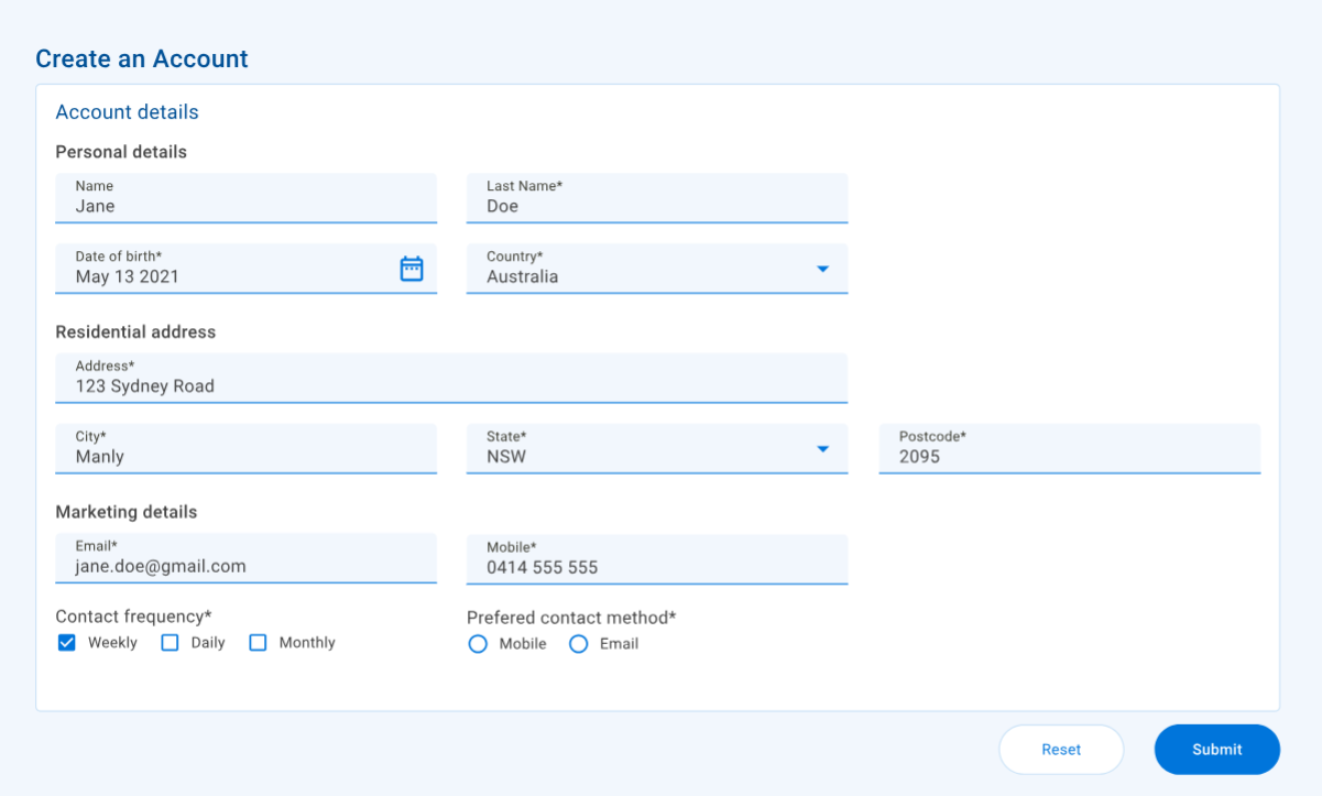
Our components are designed for use in two different layout densities: standard and compact.
- Use a standard density layout when designing for desktop.
- Use a compact density layout when designing for smaller displays.
If your desktop design is complex and/or contains many components, you may consider using a compact density layout instead. However, this apprach is not recommended as it can lead to a poorer user experience.
- Use standard (medium) components in a standard density layout.
- Use compact (small) components in a compact density layout.
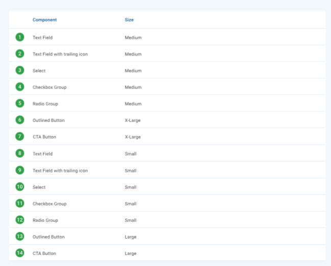
These two layout densities are illustrated in the Component Densities artboard. Component sizes for each layout density are illustrated in this artboard, and summarized in the table below.
| Component type | Standard density | Compact density |
|---|---|---|
| Input components | Medium 1 2 3 | Small 8 9 10 |
| Group components | Medium 4 5 | Small 11 12 |
| Outlined button | X-Large 6 | Large 13 |
| CTA button | X-Large 7 | Large 14 |
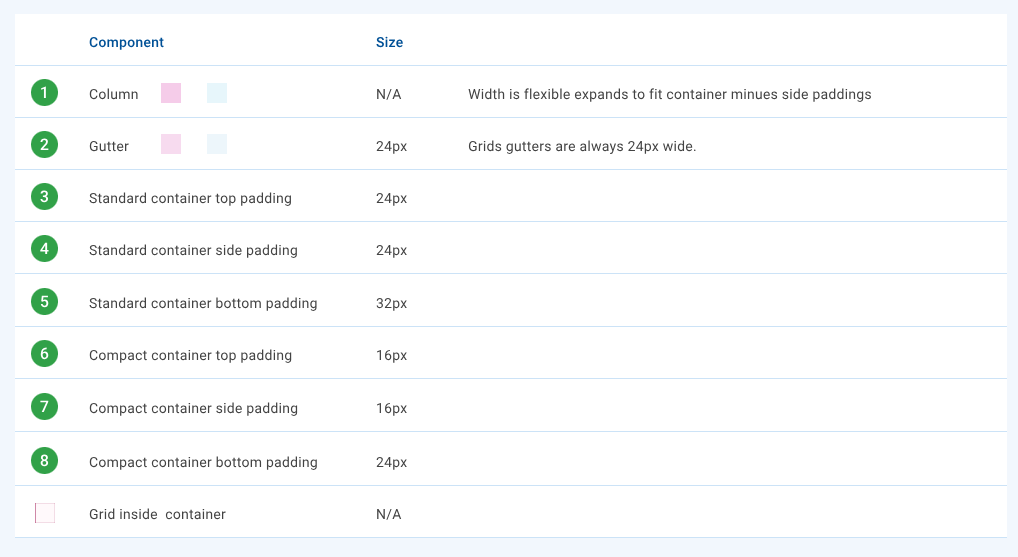
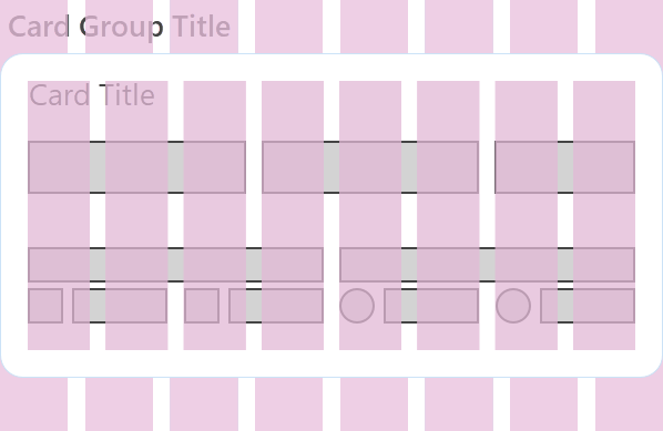
The responsive layout grid is made up of three elements: columns, gutters, and padding.
- Columns
- Gutters
- Padding
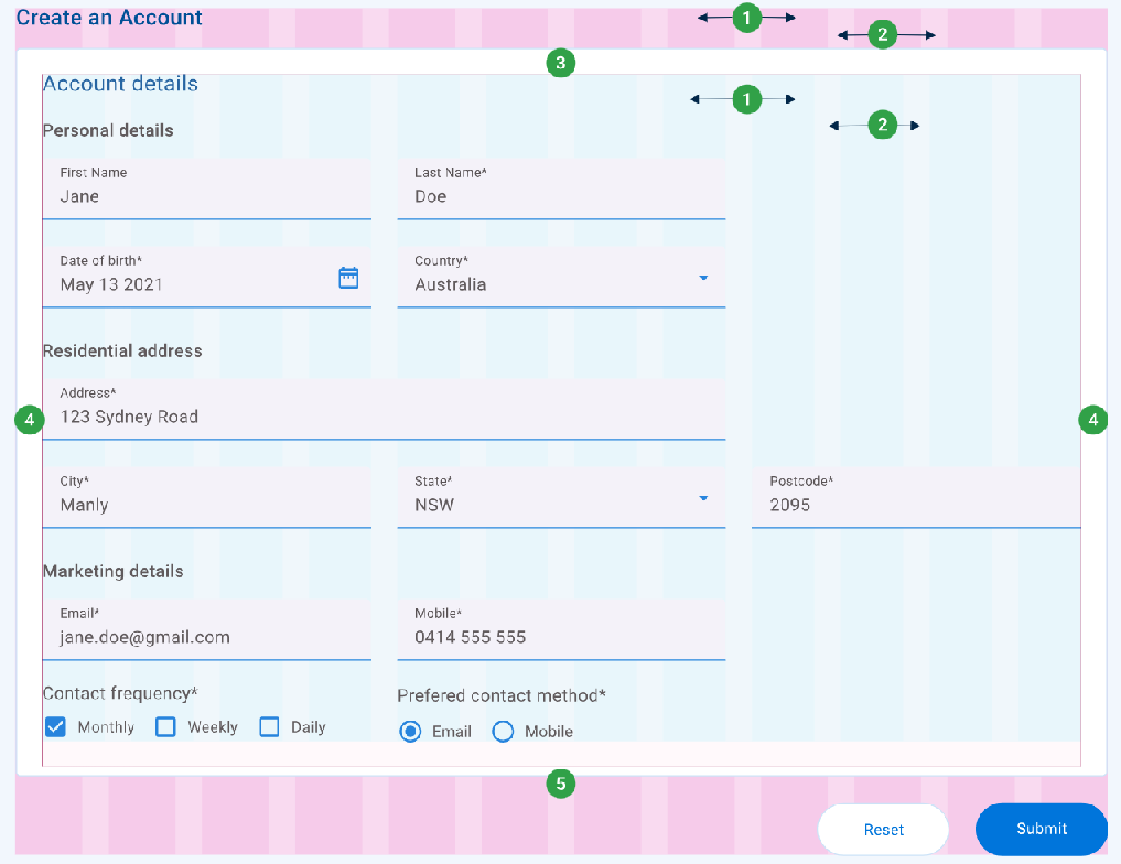
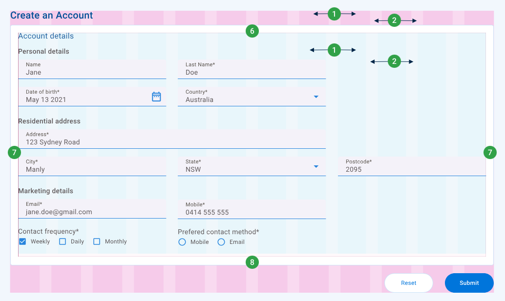
The starting point for desktop designs is a 12-column layout grid. Content is placed in the areas of the screen that contain columns. Column width is flexible, dependent upon the container width and number of columns, less gutters and padding. For more about how column width is calculated, see Column width below.
The number of columns can be adjusted to suit the scale of the design, and you might choose to use fewer columns when designing for smaller screens or narrower containers. For example, when adapting a desktop design to suit mobile devices, you could use four columns for the mobile design versus 12 columns for desktop.
- Use a 12-column page layout when designing for desktop.
- When designing for smaller displays, use a page layout with fewer columns; 4, 6 or 8 is recommended.
When adapting a responsive design for different screen sizes, consider whether you need to adjust the width of components to fit the number of columns better. For example, say you're designing a narrow layout, and you want to retain the relative size and position of components. In a narrow card, you could use fewer columns and design components to occupy a different number of columns. Alternatively, you could transform a horizontally-oriented desktop layout into a vertically-oriented layout (which is preferred for mobile devices) by using fewer page columns and retaining the same number of columns for each component.
The Responsive Layout artboard illustrates a combination of these two approaches, with the narrower card resized to use only 8 of the form's 12 columns. While the card continues to use a 12-column grid layout internally, components within the card are resized to occupy more columns with the exception of the City, State, and Postcode fields which retain their column width but become narrower because the card has become narrower.
Gutters are the spaces between columns that help separate content.
While components often span across gutters, as a general rule they should not start or end in gutters.
Use a 3G gutter between columns, regardless of layout density or the number of columns.
Container padding is used to create space around a container's content, inside the container's defined borders.
By default, do not position components within a container's padding.
- For standard density layouts, use 3G padding.
- For compact density layouts, use 2G padding.
The column width within a container is dependent on the container's width (that is, the number of columns it occupies in it's parent container), gutters, and padding. This is illustrated in the Responsive Layout artboard which shows cards of increasingly smaller widths with increasingly narrower columns but with the same gutters and padding.
For the curious, the formula to calculate the column width is shown below.
where:
Container Column Width = Container Width − ( Container Padding + Total Gutter Width ) Number of Columns
- Container Padding consists of the padding on the container's left and right sides
- Total Gutter Width = Gutter Width * ( Number of Columns − 1 )
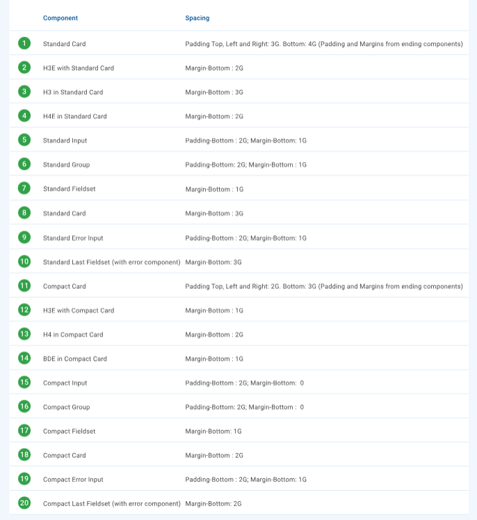
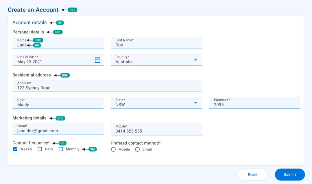
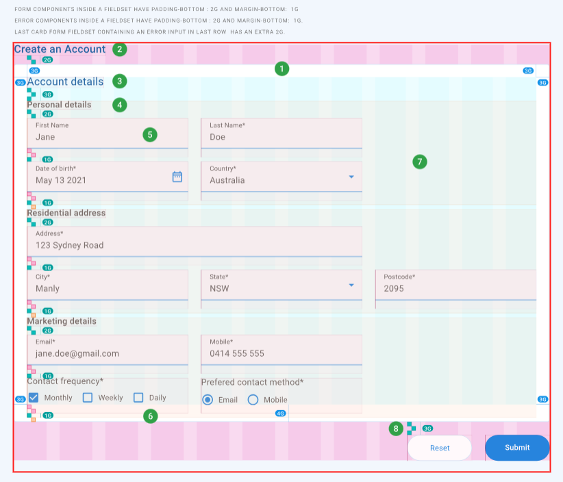
A fieldset is a non-visual layout component that provides a way to group related components that have been laid out adjacently in a container such as a card. Fieldsets help to separate groups of components as shown in the Component Spacing artboard.
Use fieldsets to group related components that are located adjacently.
Fieldsets occupy the full width of their parent container meaning that they stack vertically in their container. Each fieldset has a 1G bottom margin by default. However, if the bottommost field in the last fieldset in a container shows an error, that fieldset uses a 3G bottom margin instead. The bottom margin serves to separate groups of form elements vertically from one another in a consistent fashion.
As fieldsets have no padding, they use the same column layout as their container.
While two or more adjacent fieldsets can be grouped inside another fieldset, use this technique with care to avoid excessive vertical separation between components.
Component spacing consists of two elements: padding and margins.
- Padding
- Margin
Padding and margins provide a way to create space around and in between components, per the CSS Box Model.
Component padding, like container padding, is space inside the component on the top, bottom, left and right edges, and is considered to be part of the component. Padding is used to create space around an element's content, inside any defined borders, ensuring a desired amount of space exists on specified component edges.
Margins are used to create space around and in between components, outside of any defined borders. However, unlike padding, margins are not considered to be part of the component. Margins keep components vertically and horizontally separated. While top and bottom margins between vertically adjacent components may be collapsed, left and right margins are never collapsed.
Padding and margins determine the position of components within a container relative to adjacent components and the container's four sides. Padding is defined for each component density, while margins are defined for each layout density.
Some components display errors in their bottom padding. Whether or not an error is displayed changes the vertical spacing between these components.
- If there is no error, the component's bottom padding (2G) is added to it's 1G bottom margin to make 3G vertical spacing below it.
- If there are any errors, the component's bottom padding increases to N * 2G where N is the number of error lines displayed. Vertical spacing below the component is reduced to the component's 1G bottom margin.
The Component Spacing artboard identifies padding and margins for a variety of scenarios, summarized in the table below. Numbers like this 1 in the table correspond to the same numbers in the artboard.
- Standard density
- Compact density
| Component | Padding | Margin |
|---|---|---|
| Card 1 8 | Top, Left, Right: 3G Bottom: 4G1 | Bottom: 3G |
| Input component 5 (for example, text field) | Bottom: 2G | Bottom: 1G |
| Input component with error 9 (for example, text field) | Bottom: 2G2 | Bottom: 1G |
| Group component 6 (for example, radio group) | Bottom: 2G2 | Bottom: 1G |
| Fieldset 7 | Bottom: 1G | |
| Last fieldset with error in last component 10 | Bottom: 3G |
- Includes the bottom padding and margin of the last component; for example, a text field's bottom padding for the display of errors.
- The first error line is displayed within the bottom padding. Second and subsequent error lines increase the bottom padding.
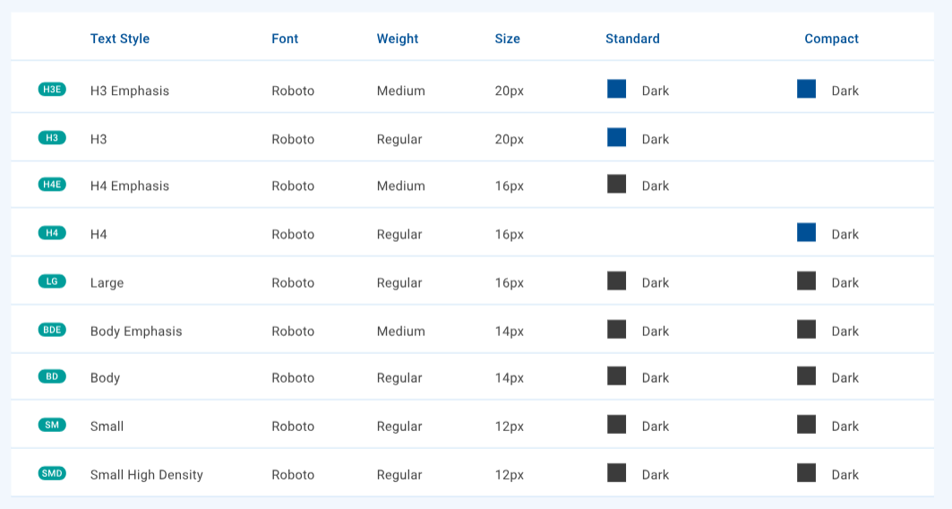
Use typography to present your design and content as clearly and efficiently as possible.
We have typography guidelines that cover:
- type scale: a set of foundational type scales that assist designers to maintain consistency in their designs
- text color: use a combination of shades from our carefully curated colour palettes to convey purpose and present a beautiful UI
- heading and body text styles: a range of styles designed to support the needs of your product and its content
- accessibility: includes WCAG 2.2 compliant color contrast guidance
Text styles are defined by combining a type scale with a text color and padding/margin. For most components, there's no need to specify text styles because standard and compact density layouts automatically use appropriately-sized components which in turn use appropriate body text styles. Headings use a greater variety of text styles. We have guidance for heading text styles on forms and in containers.
Use the same text styles in your design regardless of the layout density or number of design columns.
Components that support input validation include behavior that alert the user when the validation fails. The validation behavior associated with each component is described in each component's documentation.
The Input errors artboard illustrates input error designs for several components including how they respond to mouse hover.
Use colors from the Status Negative Palette to indicate validation failure.
For information about text field validation, see Text Field > Validation and errors.
The horizontal line at the bottom of a text field component changes it's appearance to indicate when the text field is active.
- Change the background color to
status-negative-lightest. - Change the activation indicator's color to
status-negative-primary. - Display error text beneath the activation indicator.
- Change the activation indicator's line width to 2px.
For information about radio buttons, see Radio.
- Change the radio button's color (the outer ring and, if it's selected, the inner disc) to
status-negative-primary.
- Use
status-negative-lightestas the color for the radio button's visual feedback on hover.
For information about radio groups, see Radio Group.
- Apply the Radio button validation failure guidelines (see above) to all radio buttons in the group.
- Display error text beside the radio group's text label (to the left in a LTR context).
For information about checkboxes, see Checkbox.
- Change the checkbox's color to
status-negative-primary.
- Use
status-negative-lightestas the color for the checkbox's visual feedback on hover.
For information about checkbox groups, see Checkbox Group.
- Apply the Checkbox validation failure guidelines (see above) to all checkboxes in the group.
- Display error text beside the checkbox group's text label (to the left in a LTR context).