Use typography to present your design and content as clearly and efficiently as possible.
The best typography is adaptable and offers a range of ways to be used within a design. Sometimes it may need to be expressive and others times it may need to be more serious.
We have chosen a distinctive font stack that can easily transition throughout our platform for a variety of uses. It can be welcoming and playful for marketing designs or usable and simple in our products. It is optimized for legibility within an interface and has a high level of performance within our digital platform. For marketing, it can be used for everything from bold landing page headlines to beautiful, publication-level content designs.
Our font stack is based on Google's freely available [Work Sans][worksans-font] font.
Too many type sizes and styles at once can spoil any layout. A good type scale has a limited set of type sizes that work well together along with layout and spacing guidelines. Our type scale is a combination of font styles supported by the type system, containing reusable categories of text.
| Scale category | Font | Weight1 | Size2 | Letter spacing2 | Line height2 | Case3 |
|---|---|---|---|---|---|---|
| H1E Heading 1 Emphasis | Work Sans | Medium | 24 | 0.25 | 28.8 | Sentence |
| H1 Heading 1 | Work Sans | Regular | 24 | 0.25 | 28.8 | Sentence |
| H2E Heading 2 Emphasis | Work Sans | Medium | 20 | 0.25 | 24 | Sentence |
| H2 Heading 2 | Work Sans | Regular | 20 | 0.25 | 24 | Sentence |
| H3E Heading 3 Emphasis | Work Sans | Medium | 16 | 0.15 | 19.2 | Sentence |
| H3 Heading 3 | Work Sans | Regular | 16 | 0.25 | 19.2 | Sentence |
| LG Large | Work Sans | Regular | 16 | 0.15 | 24 | Sentence |
| BDE Body Emphasis | Work Sans | Medium | 14 | 0.25 | 21 | Sentence |
| BD Body | Work Sans | Regular | 14 | 0.25 | 21 | Sentence |
| SMX Small Expanded | Work Sans | Regular | 12 | 2 | 18 | All caps |
| SMB Small Bolder | Work Sans | Bold | 12 | 0.4 | 18 | Sentence |
| SME Small Emphasis | Work Sans | Medium | 12 | 0.4 | 18 | Sentence |
| SM Small | Work Sans | Regular | 12 | 0.4 | 16 | Sentence |
| SMC Small Compact | Work Sans | Regular | 11 | 0.4 | 16 | Sentence |
| XS X-Small | Work Sans | Regular | 10 | 0.4 | 15 | Sentence |
| XSX X-Small Expanded | Work Sans | Regular | 10 | 1.67 | 15 | All caps |
| XSBX X-Small Bolder Expanded | Work Sans | Bold | 10 | 1 | 15 | All caps |
- Regular = 400, Medium = 500, Bold = 700. For more details, see Common weight name mapping.
- This number is expressed in pixels.
- Sentence case = The first letter in uppercase and all remaining letters in lowercase. All caps = All uppercase letters.
Color can express whether text has greater, or lesser, importance relative to other text. Color also ensures text remains legible when placed above imagery or backgrounds, which can make it difficult to read the text in front of them.
The standard background color for pages is temenos-lightest, and we recommend using temenos-dark text color for all headings/titles on pages per our WCAG 2.2 compliant color contrast guidelines.
Use temenos-dark for heading text that appears on a temenos-lightest background, such as a page heading or any other heading that appears directly on a form page.
Containers, like cards and expansional panels, use white as the background color, providing a greater range of options for text color. By default, use temenos-dark for headings and titles in containers, and greyscale-dark for other text. However, if your design calls for a dark background, use an appropriately light text color instead; see the color contrast guidelines for options.
white background:- Use
temenos-darkfor the first heading; for example, a card title. - Use
greyscale-darkfor all other headings; for example, section titles in a card.
Within the body of a container, components with text elements – for example, text fields, checkboxes, and radio buttons – use greyscale-dark by default for their text elements. However, other text colors can be used for specific purposes.
white background:- The default color for all text elements of all components is
greyscale-dark. - Use
temenos-primaryfor component text elements to indicate components that the user can interact with.
The following typography guidelines demonstrate recommended use of typography for various purposes.
Headings organise information, helping users scanning for content to find what they need. Use headings to impose structure on pages and within other containers. A heading serves to group components as well as providing a high-level description of the component group. Write headings that tell the user what is in the content below it.
Page headings and sub-headings use the largest type scales, regardless of layout density. While every page must have a heading at the top of the page, scenarios requiring page sub-headings are less common.
- Use H1E Heading 1 Emphasis for the main heading at the top of a page only.
- Use H1 Heading 1 for page sub-headings when you need to group multiple container groups in order to apply structure to a page.
The heading on a form for a group of containers – such as cards or expansion panels – use the same type scale regardless of layout density but have different bottom margins for standard and compact density layouts.
- a 2G bottom margin for standard density layouts;
- a 1G bottom margin for compact density layouts.
Headings inside containers use different type scales depending upon the layout density. By default, a design created for a compact density uses headings one size smaller than the equivalent standard density design.
Here are some common heading scenarios and the type scales to use for standard and compact density layouts. Note that the most commonly used heading styles generally use emphasis type scales. Further, note that headings that appear (in a container) on a white background use a grayscale color except for the first heading in the container (that is, the container's title).
- Standard density
- Compact density
| Text use scenario | Type scale | Text color | Bottom Margin |
|---|---|---|---|
| Page heading | H1EHeading 1 Emphasis | temenos-dark | 3G |
| Page sub-heading | H1Heading 1 | temenos-dark | 3G |
| Container group title | H2EHeading 2 Emphasis | temenos-dark | 2G |
| Container title | H2Heading 2 | temenos-dark | 3G |
| Container section title | H3EHeading 3 Emphasis | greyscale-dark | 2G |
Body text styles are used for all non-structural text, such as the text elements (labels, values) in components, and larger blocks of informational text.
In general, the type scale for body text in non-heading components is determined by the choice of layout density. You can use other type scales for component text elements but do this sparingly – and only if there is a specific need or purpose – to avoid muddying your design with too many or inconsistent type scales.
By default, use non-heading components that match the density (standard or compact) of your layout. That is, use standard (medium) components in a standard density layout, and compact components in a compact density layout.
Here are a few body text scenarios and the type scales for standard and compact density component versions.
- Standard density
- Compact density
| Text use scenario | Type scale | Text color |
|---|---|---|
| Group label | LGLarge | greyscale-dark |
| Group item label | BDBody | greyscale-dark |
| Component label | SMSmall | greyscale-dark |
| Component value | LGLarge | greyscale-dark |
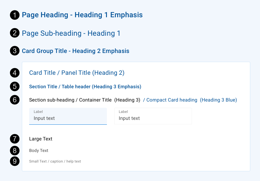
| # | Usage | Style | Text Color |
|---|---|---|---|
| 1 | Main heading on a page/form | H1E | temenos-dark |
| 2 | Second-level heading (sub-heading) on a page/form | H1 | temenos-dark |
| 3 | Container group title; for example, the heading above a card group on a page | H2E | temenos-dark |
| 4 | Container title – the first heading inside a container | H2 | temenos-dark |
| 5 | Container section title | H3E | temenos-dark |
| Table header row | H3E | temenos-dark | |
| 6 | Structural second-level section title/heading (sub-heading) inside a container such as a card or expansion panel | H3 | greyscale-darkest |
| Title/Heading of a second-level container (e.g. a card inside an expansion panel) | H3 | greyscale-darkest | |
| Compact style alternative for any title/heading in a card (helps to reduce the amount of blue colour on the page) | H3 | temenos-darkest | |
| 7 | Large text inside a container such as a card or expansion panel | LG | greyscale-darkest |
| 8 | Body text inside a container such as a card or expansion panel | BD | greyscale-dark |
| 9 | Small text, caption or help text inside a container such as a card or expansion panel | BD | greyscale-primary |
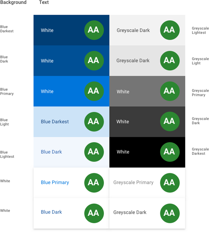
Material Design provides some brief guidance for accessible typography. Our design system builds on this, adding color contrast guidelines for text which has been validated to meet the WCAG 2.2 AA minimum contrast guideline.
To create contrast between text elements and the background, you can use light or dark variants of the primary colors. We have developed the color system so you can select your text and background color combinations to meet the following AA contrast requirements:
- 4.5:1 – Standard type: all text and non-text elements.
- 3:1 – Large, heavier type: text 18px and above, 14px bold and above, as well as non-text elements requiring contrast.
The WCAG 2.2 compliant text and background color combinations in our color system are shown below.
- Google Fonts – [Work Sans][worksans-font]
- Material Design – Material Foundation > Typography > The type system
- Material Design – Material Foundation > Color > Applying color to UI > Typography and iconography
- Web Content Accessibility Guidelines (WCAG) 2.2 – Success Criterion 1.4.3 Contrast (Minimum)
[worksans-font]: <https://fonts.google.com/specimen/Work+Sans "Google Fonts > Work Sans"