
UUX Combining Web Components for Business Application
This guide, including a demo, explains how multiple Temenos
UUX Web Components
UUX Web Components are individual Web Components that perform specific functions. Developers use them as building blocks for banking applications.
Meaningful Business Applications
You can build many applications with Temenos solutions; for example, with just a few Components you can:
- Display a list of customers
- Select a customer
- Display the accounts list for the selected customer
- List transactions for a selected account
The Components referred to in this section are contained in the below JavaScript file unified-ux-socket.min.js. This file creates the business application by registering
Using the setData method available in each Component, the Event Listeners:
- React to the user action by fetching data from the API as needed
- Display the appropriate Web Component
- Setting the data to the appropriate Components
-
- unified-ux-socket.min.js.
-
<!DOCTYPE html>
<html lang="en" dir="">
<head>
<meta charset="UTF-8" />
<title>Linked Components Demo</title>
<meta name="viewport" content="width=device-width, initial-scale=1.0, maximum-scale=1.0, user-scalable=0" />
<link href="./dist/base.css" rel="stylesheet" />
<link href="./dist/socket.css" rel="stylesheet" />
<link href="./dist/composite.css" rel="stylesheet" />
<script type="text/javascript" src="./dist/unified-ux-socket.min.js"></script>
<!-- Script that loads dynamic tabs and adds event listeners -->
<script type="text/javascript" src="./dist/composite.js" defer></script>
</head>
<body>
<uwc-grid container alignItems="center" class="hidden" id="root">
<uwc-grid item id="header" xs="12">
<uwc-text variant="h1" noMargin>UUX Combining Web Components For Business Application</uwc-text>
</uwc-grid>
<uwc-grid item id="content" xs="12">
<uwc-tab-bar id="tab-bar">
<uwc-tab label="Find customer" icon="groups">
</uwc-tab>
</uwc-tab-bar>
<uwc-grid container>
<uwc-grid item id="top-container" class="container" xs="12">
<div data-tab-id="mdc-tab-1">
<!-- Customer search component definition -->
<uwc-customer-search class="tab-content">
</uwc-customer-search>
</div>
</uwc-grid>
<uwc-grid item id="bottom-container" class="container" xs="12">
<div data-tab-id="mdc-tab-1">
<!-- Customer list component definition -->
<uwc-customer-list class="tab-content hidden" hideHeader="true">
</uwc-customer-list>
</div>
</uwc-grid>
</uwc-grid>
</uwc-grid>
</uwc-grid>
</body>
Note: Include the uwc-customer-search Component and uwc-customer-list Component in an html page by using opening and closing tags.
How do the Components work together to Create Applications?
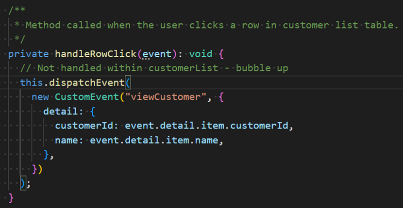
UUX Components trigger various
You can see the code that triggers the custom Event "viewCustomer" below.
(The customerId and name values are retrieved from the Customer List API.)
Procedure: How to use the UUX Combining Web Components For Business Application Demo
1. Open the Demo Page UUX Combining Web Components for Business Application.
The Customer Search Screen displays using the uwc-customer-search Component.
When you click the
You can search by filter category or click Search for a list of all customers.
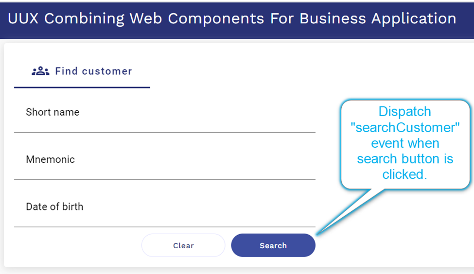
2. The JavaScript included in the page has a “searchCustomer”
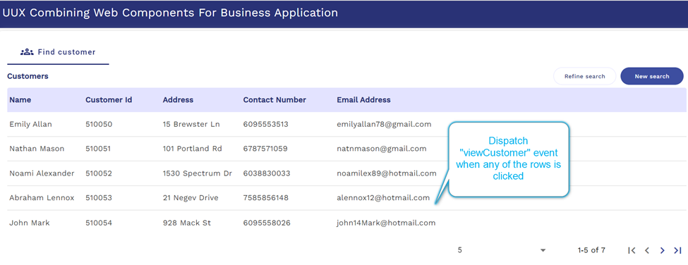
3. The uwc-customer-list Component displays the list of customers in a table.
Click on any of the rows in the table to dispatch the “viewCustomer” Event.
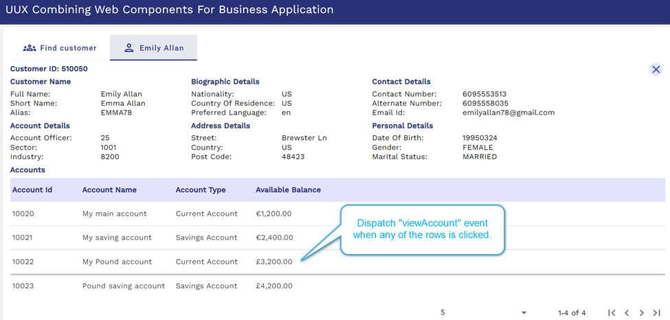
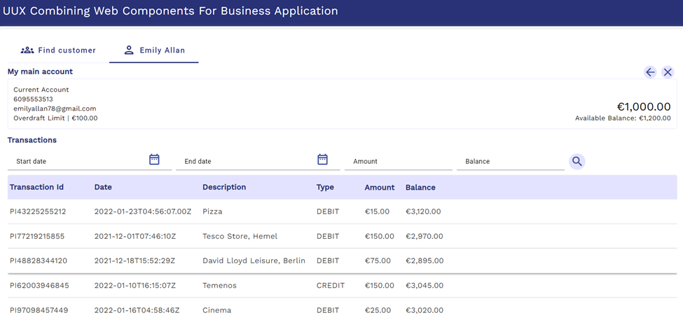
4. The “viewCustomer” Event Listener displays the uwc-customer-summary Component and the uwc-account-list Component based on available data. These components appear in a new tab using the uwc-tab-bar Component and the uwc-tab Component.
5.Click on any of the accounts in the table on the uwc-account-list Component to dispatch the “viewAccount” Event.
6. The “viewAccount” Event Listener displays the uwc-account-summary Component at the top of the screen and the
On the top right-hand of the screen, there's a Cross button and a Back-arrow button.
Click the Back-arrow button to go back to Customer Summary or Account List.
Click the Cross button to close the tab.
Events Dispatched by Different Component name
The following table lists Events triggered by each Component name and the properties it displays.
|
Component |
Event Name |
Properties available in event detail object |
|
uwc-customer-search |
searchCustomer |
shortName, mnemonic, dateOfBirth |
|
uwc-customer-list |
viewCustomer |
customerId, name |
|
uwc-customer-summary |
listAccounts |
customerId |
|
uwc-account-list |
viewAccount |
accountId, accountName |
|
uwc-account-summary |
viewAccount |
accountId, accountName |
|
uwc-transaction-list |
rowClick |
detail |
More Information
- See Tab Bar for more information about
Tab Bar Usage. - See Grid Usage for more information about page flow and communication of data. Use the uwc-grid Component to position Components in your design effectively. How information displays in business applications is based on various Events dispatched by the different Components.
- See Customer List API.
- See Developing Modern Browser-Based User Experience (UX).