Temenos UXP is a horizontal User eXperience Platform (UXP) that allows you to rapidly manage, build, localise and package a web-oriented front-end solution. It provides a rich user experience that can be applied to any market vertical and can be integrated flexibly with back-end solutions.
The aim of this guide is to introduce people familiar with the UXP Framework to the ways that it can be used with Unified UX web components.
The simplest way to introduce UUX controls in your solution is to use the new default_uux theme in your presentation, be it a traditional Rich presentation or a more modern React-based CSR presentation. UXP has wrapped and mapped the UUX web components to theme designs for both presentation types and the functionality is available for Rich from UXP v21.8 and CSR from UXP v21.11.
The UUX controls' styling is built-in; UXP ignores the style input fields in the design properties dialogs. Customer-specific branding may be achieved by using CSS overrides and local variables. The branding CSS file shown in the snippet below can be declared as a theme resource.
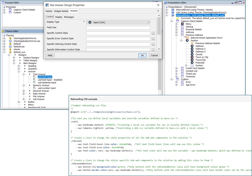
A way to renovate an existing UXP application is to duplicate the current presentation and set another theme that uses UUX widgets. In this way, you can change the design and the layout of the page without interfering with the existing application. UXP already provides a UUX default theme that can be used as a starting point for the new theme.
An example of such a renovation is the ClientApplicationForms app included in the sample projects delivered in UXP (look in the installation's RTE/Samples folder). The original application has had two new presentations added that instead use the default_uux theme.

At runtime, the UI has been transformed. It is notable that the layout is very different as the UUX controls combine the question label with the input itself rather than making use of the older columnal format traditionally used by UXP.
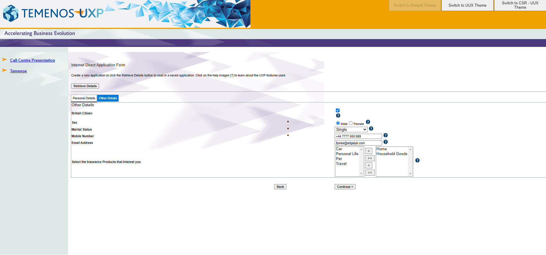
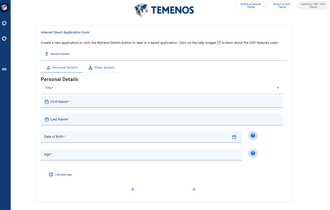
Take a look at the deployed version Client Application Form solution. Switch between the different presentations using the buttons at the top of the screen to experience the modernised UI and the original UI.
Alternatively, an existing presentation can be updated by swapping in UUX designs for specific UI controls. This method will give developers option to progressively enhance the app.
Many applications have been built using the Temenos Theme, which offers additional styling, controls, and functionality above and beyond the default theme supplied with UXP.
It is proposed that a new Temenos Theme subtheme will be the best method to achieve such a renovation. Applications using Temenos Theme will not want to make changes to their presentation in order to update to UUX-style controls. By taking the subtheme approach, a simple change may be made to the application using the Switch Presentation and Theme Rule, which will change the runtime presentation but preserve all design references. UXP will be enhance so that any new properties of the widgets introduced in through the subtheme will be also be displayed and configurable through the Presentation Properties dialog.
Developers may need to go beyond the use of the out-of-the-box UUX designs in their applications. Bespoke UUX controls can be created for any application, and some Learning Resources are available on this website to help you do this. Also, new web components are frequently being added to the UUX library and may not yet be bundled in a UXP release. To make use of such UUX web components, the user should write a UXP widget (widgets are complex, customisable UI controls you can use in your solution).
The first step is to choose the UUX component and identify which of its properties you want to use in UXP and how they should be mapped across. The developer will need to analyse:
- which UUX component properties will be used,
- which properties already have a corresponding property in UXP,
- which properties will be displayed in the Presentation Properties Dialog in the IDE,
- which properties will be set at design level in the theme.
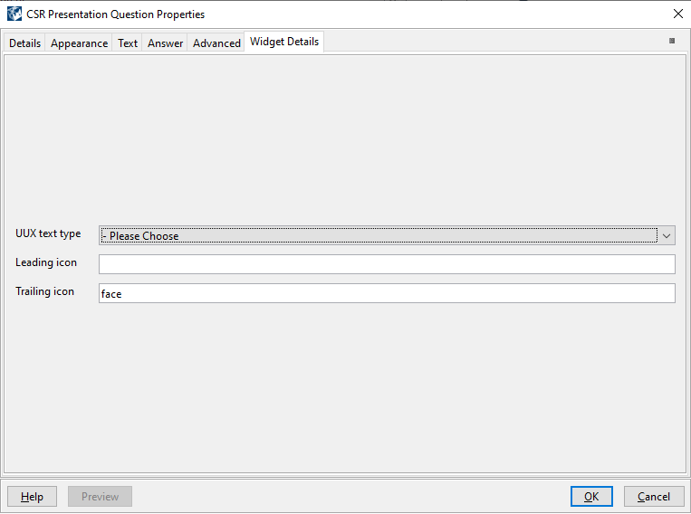
By example, UUX Text Field has many functional properties that are inherited from Material Components Web – TextField plus several properties defined itself. Some properties already have equivalents to map to in UXP Presentation Question Properties dialog, like prefix, postfix, or in Question Properties dialog or the ones related to the validation (regular expression, min field length, max field length):
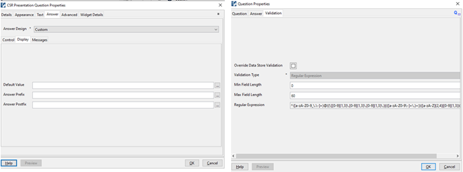
All the properties that a user would want to set based on the context of the question could be defined in widget definition and they will then appear in widget details tab from UXP Presentation Question Properties dialog:
In Temenos UXP, the look and feel of a solution is managed by a theme. A theme controls, for example, the display types used, styling and sizing of elements on a page. A theme is a collection of designs which are defined for each type of element, for example e.g., heading, table, list. A design defines the appearance of each of the elements that make up a solution. So, another important step in working with UUX widgets is to establish what look and feel properties are defined at design level.
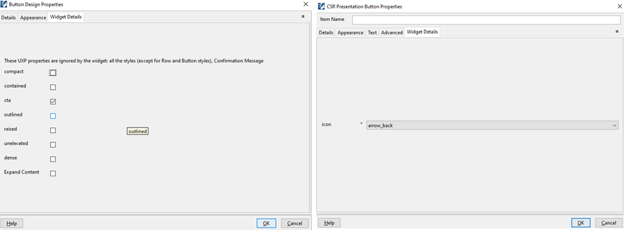
For example, for UUX Icon Button widget, some of display properties are set at design level because they are set once for all buttons. Other display properties are set in the UXP Presentation Button Properties dialog because they need to be set according to the specific context of the button, as can be seen below. For more information about widget development, have a look at the UXP Widgets Guide on the Temenos Documentation portal.
When integrating new UUX components into UXP, there could be a difference between functionality that is available in the UXP controls and the functionality available in the UUX components. One technique for handling the case where the UXP control provides additional functionality would be to add another data item to exclusively use the UUX behaviour. The developer would add logic to conditionally display the relevant data item's question based on the running presentation's name.

For example, the text area from UXP has the option to include a spell checker, but this option is not available in the UUX text area component.
- UXP theme would display the 'Additional Information' question

- UUX theme would display the 'Additional Information - UUX' question

In UUX, there are components that do not have a corresponding control in UXP, such as the UUX Switch widget. Another process element could be added or an existing one could be changed to use the new UUX component. In the client application form, some two-item lists are set up to use a UUX Switch design as an alternative to a checkbox, so you can see similar functionality offered two ways in the UI.

This concludes our overview of the ways you can use UUX web components in UXP. It is also possible to include large UUX business components, which encapsulate business logic and UUX controls within a larger web component, in UXP. This offers the possibility of adding complex components into applications with minimal integration, and shall be the subject of a future demo.