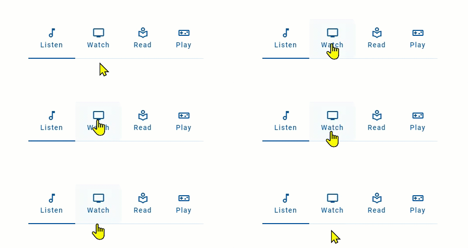
Tabs organize content across different screens, data sets, and other interactions.
Tabs organize and allow navigation between groups of content that are related and at the same level of hierarchy. Use tabs to swap between different views of related data (one dataset or connected datasets) that shares a common context.
Each tab contains content that is distinct but related; for example, a tab set for news might have tabs for different sections. The tabs in this example serve to distinguish different kinds of news, allowing the user to focus on areas of interest.

Things to avoid:
- Tabs that aren't related in the same way – For example, an About tab in a news tab set with tabs for news sections may be interpreted by users as representing navigation.
- Tabs containing content that needs to be seen at once – Forcing users to swap between tabs in order to complete a task requires them to remember information unnecessarily, introducing a risk of error.
- Long tab labels – Shorter tab labels using are easier for the user to scan and find what they need. Keep tab labels to 1-3 small words. Longer tab labels suggest more complex concepts take time to process.
- Inconsistent use of icons – For more information. see Icons.
The following image shows four tabs.

- Container
- Icon (optional if there's a label)
- Text label (optional if there's an icon)
- Fill – Identifies active/focused tab in conjunction with tab indicator
- Active tab indicator
- Inactive tab indicator
Tabs can use icons in addition to or instead of text labels.
- Tabs with text labels
- Tabs with text labels and icons
- Tabs with icons
When including an icon with a text label, do it consistently for all tabs. For example, avoid the following scenario.
Generally, icons communicate meaning less effectively than text, so prefer universal or standard icons when using icons on their own. This is especially applicable when tabs represent complex ideas.
Icons can be stacked on top of text labels.
When stacking icons, do it consistently for all tabs. Avoid the following scenarios.
- Inconsistent use of icons – stacked icon versus inline icon
- Inconsistent use of icons – text label with stacked icon versus text label and no icon
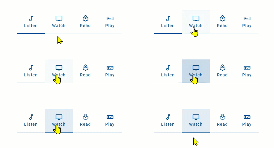
Tab bars are Interactive components that provide visual feedback when the user interacts with them.
Tab bars provide visual feedback when the pointer hovers over the tabs.

When pressed, tabs provide visual feedback in the form of a ripple fill.

Our components have been designed to comply with the WCAG 2.1 AA accessibility guidelines. For more information about how this design system complies with color-related accessibility guidelines, see Foundations > Colors > Accessibility.
- Material Design – Components > Tabs
- Material UI – Components > Navigation > Tabs
- Carbon Design System – Components > Tabs > Usage
- Jakob Nielsen, Tabs, Used Right (Nielsen Norman Group, 2016)